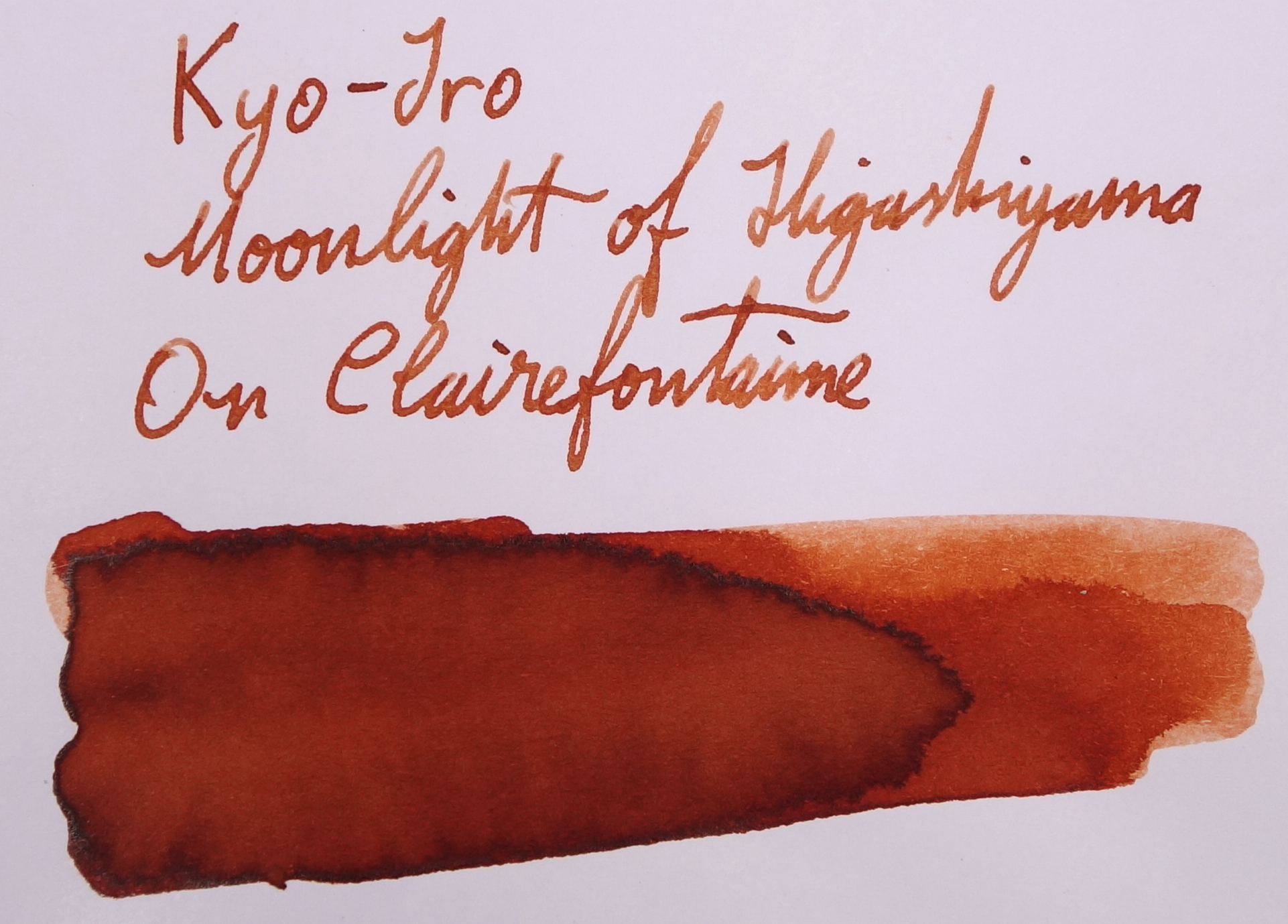
Kyo-Iro Moonlight of Higashiyama was one of the inks from the Kyo-Iro and Kyo-no-oto series that I was most looking forward to trying. Unfortunately, the ink has been a slight disappointment; in the swatch form it's quite a great looking colour but it just didn't perform well enough in the pen. I purchased this ink from Sakura Fountain Pen Gallery and others in the series also from Takedajimuki

The ink is very dry in the nib. In my quite wet OMAS Paragon it was decent but flow was still rather weak which affected lubrication. The colour is an orange leaning brown that isn't particularly saturated. In a wet nib it can get quite brown where the ink pools; where it doesn't, it is a week yellow-orange brown.

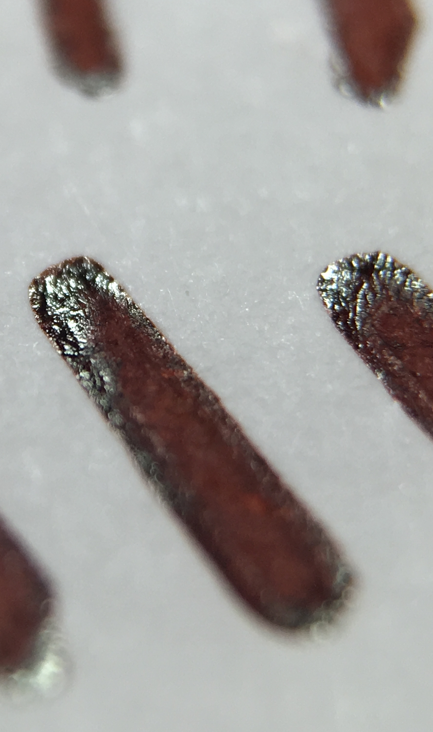
Left: OMAS Paragon. Right: Diplomat Excellence A
When you do squeeze some ink out of a wet pen, however, the shading was pretty pleasant but if you have a somewhat fine-nibbed pen or a dryer pen there's very little shading . My Diplomat Excellence A is a moderately wet pen and the colour comes out completely different to my very wet OMAS; yellower with little shading and none of the dark brown. In the dryer - but by no means a dry - Sailor 14k Sapporo/Pro Gear Slim the ink has no shading and any dark colour is completely absent.
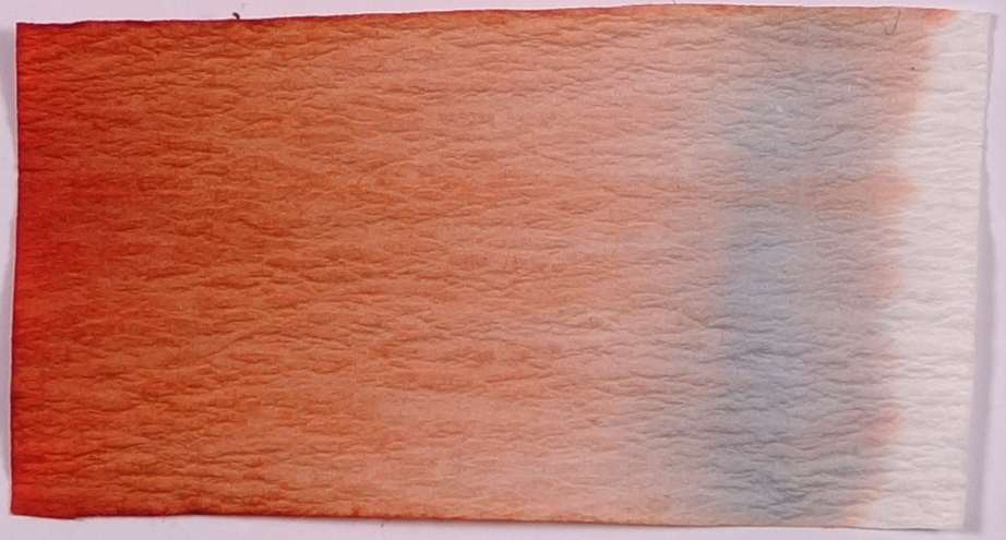

If you can manage to put a wet line down on Tomoe River paper, the ink produces a subtle silver sheen where the ink pools. I couldn't get any sheen from the ink on Rhodia and I doubt the silver sheen would be too apparent with cursive writing on Tomoe River without looking carefully. Apart from some blue-grey where the line was put on the paper, the chromatography shows that the ink is rather straightforward in construction. The ink is pretty much not water resistant but it might still be possible to read it after a small spill.
1) Diamine Ancient Copper; 2 )L'Artisan Pastellier Anahuac; 3) Diamine Terracotta; 4) Akkerman #22 Hopjesbruin; 5) SBRE Brown; and 6) Diamine Brandy Dazzle
The ink is most comparable to Diamine Terracotta. Ancient Copper, and Brandy Dazzle are redder with less yellow. The Akkerman (which looks strikingly similar to Diamine Sepia) has much less red and SBRE Brown also has less red. L'Artisan Pastellier Anahuac also lacks some red.
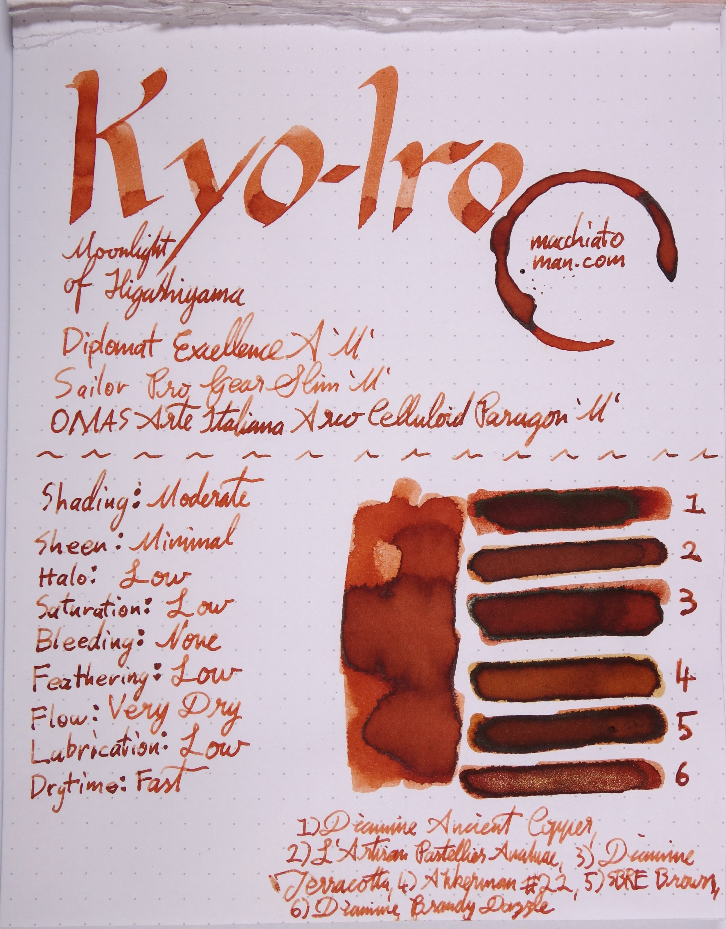
If you can put this ink in a wet broad pen it can look quite nice but otherwise I can't really recommend it too highly. Terracotta is better value for money and available more readily. I've read that this is the driest of the Kyo-Iro and Ky-no-oto line so hopefully the rest are more enjoyable to use. It's a shame because I really do enjoy the colour when you can get the ink out of the pen!
I've listed all my inks and all my pens in their respective pages. Please let me know which inks you'd like to review next via the comments, Twitter, Instagram, or contact me directly.
I was not compensated for this review and everything here is my own honest opinion. There are no affiliate links.