• Blog
  • About
    • My Inks (on Fountain Pen Companion)
    • My Pens
  • Archive
  • Contact
Menu

Macchiato Man

  • Blog
  • About
  • My Collection ☟
    • My Inks (on Fountain Pen Companion)
    • My Pens
  • Archive
  • Contact
The @madebyendless Cotton Wallet arrived the other day! I’m a sucker for these sorts of practical inserts for notebooks. The cotton fabric suites the simple style of the Explorer. 
⠀
While I love these and always get them whenever I can I never
First test of the Regalia paper in the Endless Explorer than I was sent by @madebyendless. Really impressed by the paper. Very smooth, nice sheen and nice shading! Finger prints or hand oil seem to affect the writing a little but nothing out of the o
New Pen Review: Esterbrook Camden (Premium Edition) - 𝙻𝚒𝚗𝚔 𝚒𝚗 𝙱𝚒𝚘!

I’ve been eager to try the Camden for a while now. I love my flat end pens and the overall shape of this one is subtly unique. While there are some differences between
New friend from @esterbrook_official! Camden Manitoba Blue. 
⠀
Love flat end pens so looking forward to digging into this (so review incoming).
 
Flat or round ends?✑
⠀
⠀
⠀
⠀
#fountainpen #fpgeeks #fountainpenaddict #fpn #fountainpengeeks  #fountainp
New Ink Review: @birminghampens Antique Sepia (link in bio)
⠀
In line with the recent trend of soft pastel dichromatic inks but Birmingham’s version is an interesting dust grey version with low saturation that I find quite interesting don&rsquo
New Ink Day! Haven’t had one of these for a while but I received these from a friend at the last Perth Pen Meet. 
⠀
All sailor and the first tall bottle in a while (bringing the number of those to 86). 
⠀
Didn’t realise it at the time but
New Ink Review: La Couronne du Comte Vert Sapin (link in bio)
⠀
The final of LCdC’s initial set of four exclusive inks from Diamine. A lovely rich sheeny green-teal.
✑
⠀
⠀
⠀
⠀
#fountainpen #fpgeeks #fountainpenaddict #fpn #fountainpengeeks  #fo
I don’t know if I’ve ever shared this before but my city has a set of five dip nibs as an artwork. 

They are called “Memory Markers” by Anne Neil and represent early-ish colonial stories of the gardens where they are.

We als
⚠️Update: Why I have been so radio silent! 📻🤫 A lot of large personal changes, essentially (read on for details)!

There have been three main reasons for why I haven’t been able to do much here or on my blog. 

1) 🎓 I had to finish of my Mas
Ink Ink Comparison: Discontinued Iroshizuku and New Iroshizuku! Thanks to @penclassics for allowing this to happen. See link in bio!
⠀
The old: Tsuyu-kusa, Tsukushi, and Ina-ho.
The New: Sui-gyoku, Hana-ikada, and Hotaru-bi.
⠀
This is a long review b
NPD: @esterbrook_official LE Estie “Candy” in Oversize with a Kirk Speer Needlepoint nib!
⠀
Thanks to Esterbrook for sending this through to me for review. I’ve reviewed a couple of Esties now and two of the custom nibs (which are a
Out with the old in with the new?

I just received the new Pilot Iroshizuku Inks in the little bottle ink pack from @penclassics for review. I plan on doing an overview review of the three new and the three old ones!

I feel like Ina Ho was quite a u
New Pen Review (see link in bio): Platinum Curidas courtesy of @penclassics (check them out!)
⠀
This is certainly a curiously designed pen with it's quirks but it has bee a delight to write with and a great pen to through in a pocket. I've been using
New Ink Review! @wearingeul_global Kyonghui! See link in bio!

Kyonghui is a vibrant earthy orange from Wearingeul's series on Korean Female Modern Writers. It is also a great performing ink!

Wearingeul's global push is fairly new; has anyone tried
It has been a little while since I posted here so I thought I'd give a little update!

Firstly I think I just needed a little break at the end of the year! It has been a busy year for me. I have been taking my photography more seriously and I also ha

Subscribe

Sign up with your email address to receive news and updates.

We respect your privacy. Unsubscribe at any time.

Thank you!
Blog RSS

☛ Twitter feed

✉ Email Subscription

☞ Fountain Pens Australia (Facebook Group)

☛ Sailor Pens & Inks (Facebook Group)


Sponsors

10% off code: MACCHIATOMAN


Click here for sponsorship information


Featured Posts:

Featured
Ink Review: Pennonia Pokoltuz (Pokoltűz)
Aug 1, 2019
Ink Review: Pennonia Pokoltuz (Pokoltűz)
Aug 1, 2019
Aug 1, 2019
Notebook Review: Pebble Stationery Pocket Tomoe River Notebook
Nov 10, 2018
Notebook Review: Pebble Stationery Pocket Tomoe River Notebook
Nov 10, 2018
Nov 10, 2018
Ink Review: Krishna Brown Pink
Jan 20, 2018
Ink Review: Krishna Brown Pink
Jan 20, 2018
Jan 20, 2018


Archive
  • November 2024
  • October 2023
  • December 2022
  • October 2022
  • June 2022
  • May 2022
  • April 2022
  • February 2022
  • January 2022
  • December 2021
  • November 2021
  • October 2021
  • September 2021
  • August 2021
  • July 2021
  • June 2021
  • May 2021
  • April 2021
  • February 2021
  • January 2021
  • December 2020
  • November 2020
  • October 2020
  • September 2020
  • August 2020
  • July 2020
  • May 2020
  • April 2020
  • March 2020
  • February 2020
  • January 2020
  • December 2019
  • November 2019
  • October 2019
  • September 2019
  • August 2019
  • July 2019
  • June 2019
  • May 2019
  • April 2019
  • March 2019
  • February 2019
  • January 2019
  • December 2018
  • November 2018
  • October 2018
  • September 2018
  • August 2018
  • July 2018
  • June 2018
  • May 2018
  • April 2018
  • March 2018
  • February 2018
  • January 2018
  • December 2017
  • November 2017
  • October 2017
  • September 2017
  • August 2017
  • July 2017
  • June 2017
  • May 2017
  • April 2017
  • February 2017
  • January 2017
  • December 2016
  • November 2016
  • September 2016
  • August 2016
  • July 2016

Ink Review: Robert Oster Signature Inks Kada Kada FPA Light & Dark

December 16, 2016 in Ink Review

Robert Ostster's Kada Kada FPA Light & Dark are two ink made for the Fountain Pens Australia Facebook group. After two rounds of choosing colours that Robert would base the ink off, the group chose "Kada Kada" with the colour hash code of #270567 and after that I worked with Rob to come up with this ink. The name Kada Kada means "Story" in the local (to me in Fremantle, Western Australia) Noongar language. And the hash code was chosen because it is the date (27/05/1967) that Indigenous Australians were afforded constitutional rights.

The ink can be bought exclusively from Pensive Pens in Australia.

Kada Kada Light and Dark have high saturation but are not inks with high vibrancy. Their colour is a somewhat soft and dusty dark grey purple. The main difference between Dark and Light apart from the obvious is that Dark has a less red visible. The colours to separate a little on the page meaning that you can sometimes see parts where the line is redder or bluer.

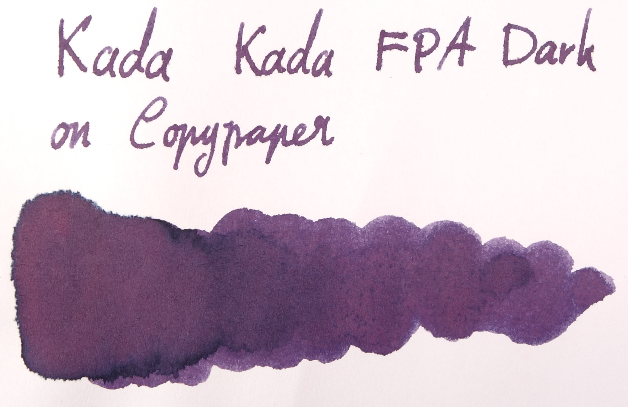
Kada Kada Light and Dark both have moderate lubrication and flow. They definitely aren't dry by any means but they aren't Sailor-level wetness either; the glide across the page nicely. The ink has good shading but it isn't extremely noticeable in wetter pens. There is some shading though to give it some character. Drytimes are on the slower end of the spectrum and the ink performs very well on Rhodia, Clairefontaine and Tomoe River but feathers pretty badly on cheap 80gsm copy paper. The colour also adopts more of a red look on copy paper and loses a lot of character. The dark characteristics of the ink wash away leaving a light pink glow behind so this ink is not very water resistant, as expected.

Somewhat astonishingly, there is absolutely no sheen on Tomoe River (though there is quite a decent halo effect on good paper). Kada Kada FPA Dark has a deep dark green sheen on Rhodia, but not on Tomoe River. This sheen doesn't appear when in a pen, however, only in wet swatch form.

View fullsize Colour #270567
View fullsize Water Resistance
View fullsize Drytime
View fullsize Light Chromatography
View fullsize Dark Chromatography

Left to right: 1) Diamine Amazing Amethyst; 2) Noodler's La Reine Mauve; 3) Robert Oster Purple Rock; 4) Private Reserve Ebony Purple; 5) Bungubox Sakanamachi Horoyoi/Tipsy Purple; 6) Sailor Shigure; and 7) Papier Plume Mardi Gras Purple

Bungubox Sakanamachi Horoyoi/Tipsy Purple is the closest of the inks I have to Kada Kada FPA Light while Private Reserve Ebony Purple is the closest to Kada Kada FPA Dark. Amazing Amethyst and Papier Plume Mardi Gras Purple are both too vibrant and red while Shigure has too much vibrant blue. Noodler's La Reine Maybe is fairly similar to Light, it lacks a lot of the shading and halo. Robert Oster Purple Rock is again similar but darker and with less shading.

Review on Rhodia

I do like this ink. It's a good professional colour with some character. The two versions are fairly similar so if you're on a budget my preference goes to the Light; I feel that the redder tone gives it an edge but I still recommend both if you can. I'm unsure as to whether this ink will be in Rob's rotation forever so I suggest buying it while you can! I'd like to thank Rob for taking the time to make an ink for our growing Australian community!

I've listed all my inks and all my pens in their respective pages. Please let me know which inks you'd like to review next via the comments, Twitter, Instagram, or contact me directly.

I received this ink free of charge for the purpose of giving an honest review. I was not otherwise compensated and everything here is my own honest opinion. There are no affiliate links. I do sell Robert Oster inks at my café but I am not allowed to sell the inks online, only in shop.

View fullsize DSC04341.JPG
View fullsize Light on Yellow Rhodia
View fullsize Dark on Yellow Rhodia
View fullsize Light on 80gsm Copy Paper
View fullsize Dark on 80gsm Copy Paper
View fullsize TomoeLight.png
View fullsize TomoeDark.png
Tags: inkreview, robertoster, purple, kada kada, FPA, fountain pens australia
← Ink Comparison: Lamy Dark LilacInk Comparison: Parker Penman Sapphire →
Back to Top

Blog RSS

✉ Email Subscription

☞ Fountain Pens Australia (Facebook Group)

☛ Sailor Pens & Inks (Facebook Group)