While Robert Oster Signature Ink's Fire & Ice isn't going to go anywhere, River of Fire hopes to be the successor to Fire & Ice's crown. Like Fire & Ice, River of Fire has a great name and a border of sheen. The ink colour itself was created based on the colour of Rob's boyhood local river green (though I assume that river wasn't made of fire!)
Read MoreSheen vs Shimmer (and some good sheeners)
Back in 2015 Brian Goulet made a video and accompanying article about sheening inks. I love sheen, in fact it's a major deciding point on whether I grab an ink or not, so this should be something right up my alley, but it wasn't. The article conflated markedly differing ink characteristics, and made quite curious decisions of which inks were chosen to exemplify the topic. He also left a number of very sheening inks off the list that Goulet Pens carry - ignoring the many sheening inks that they don't carry - such as Diamine Bilberry).
The main issue with the article (I'll just talk about the article) is that in it Brian conflated sheen resulting from the ink and shimmer/glitter resulting from particles or pigments in the ink. Now I concede that there isn't a well established term for these 'shimmering' inks. There is and was, however, an established term for the shine resulting from the ink itself: sheen!
(Moving forward I will call them sheen and shimmer)
Read MoreSite update
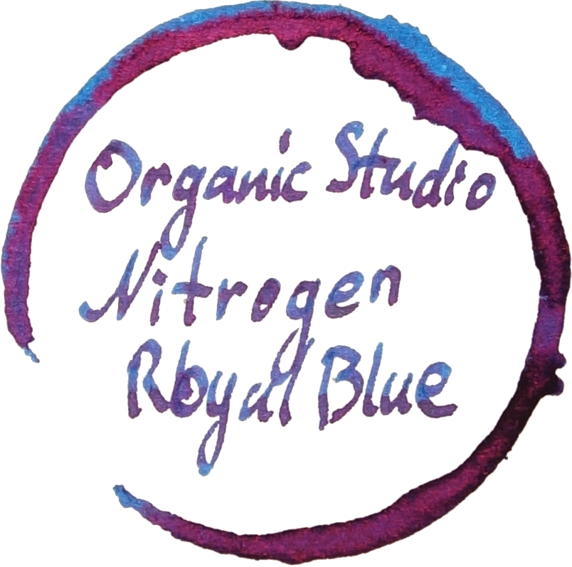
Today I made some changes to the site. Articles, along with their 30-or-so image count, no-longer completely load off the bat. Instead each post is presented as a summary and my coffee-stain ink. This should mean less wasted bandwidth and a quicker site.
I have also moved to a two-column site design which should mean that links are more quickly accessible without having to scroll all the way down.
The site also has a new email subscription to keep up with new posts. You can follow the blog the following ways
- RSS
- Email subscription
- Macchiato Man on Twitter (this is a 'feed' account)
- Myself on twitter
- Myself on Instagram
Ink Comparison: Parker Penman Emerald
In November last year I did a comparison of Parker Penman Sapphire an ink that a few other ink makers had either tried to copy or drew inspiration from. Parker Penman Emerald only has Bungubox Norwegian Wood (or Bungubox Emerald) that drew inspiration from it. Penman Emerald is the perfect green for me. I'm not a huge fan of greens in general (and generally avoid greens that lean blue) and this is the perfect, for me, balance of yellow and blue; it's slightly on the yellow side. It's got some sheen and shading which are other characteristics I am drawn to. Like the rest of the Parker Penman ink series, it was discontinued in 2000 which is around 17 years ago as of this comparison.
To avoid confusion, although Bungubox Emerald is probably the inks most well-known name I will be using its alternate name 'Norwegian Wood' to distinguish it from Parker Penman Emerald
Read MoreInk Review: Organics Studio Nitrogen Royal Blue
I picked up Organics Studio Nitrogen Royal Blue late last year and it is one of the most astonishing inks I have ever used. The sheen on this ink is like nothing else, the name of the ink is odd and the for some strange reason the ink just gets everywhere but I'm willing to overlook that given the absurd levels of sheen that this inks makes.
Read More


