
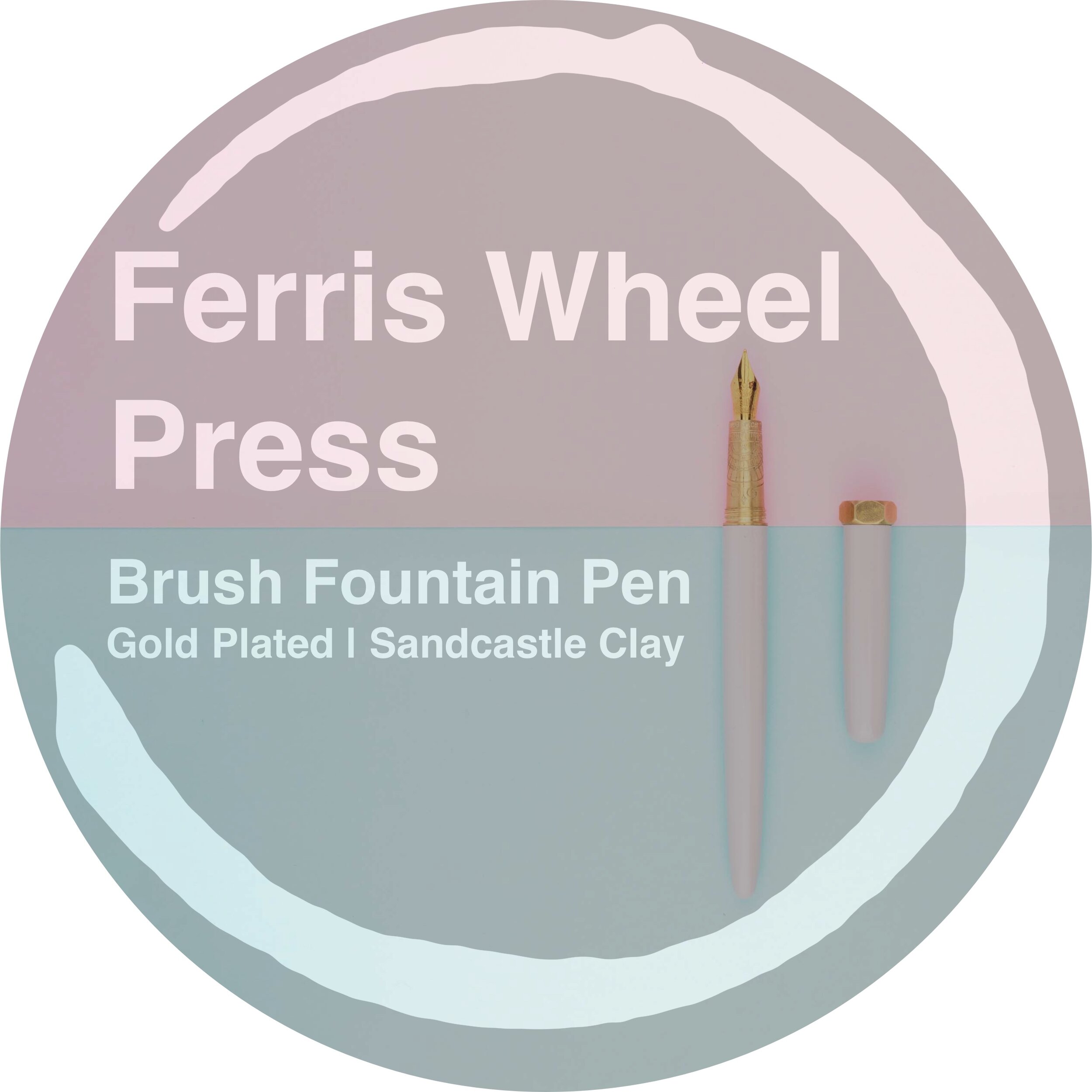
The Brush Fountain Pen, a pen I have been interested in for a while, was Canadian company Ferris Wheel Press’s first product release way back in late 2017 and since then the company has become a very well known brand with dozens of unique inks and, recently, an expansion of the fountain pen line up with the very affordable Carousel Fountain Pen. The Brush Fountain Pen Comes, firstly, with a silver trim nib or a gold plated nib, and then each of those of their own colours to choose from. The design of the pen, clear from the name, is based on a paint brush.
Thanks to Ferris Wheel Pens and Ink’d Pens for sending this ink in for review.
Ferris Wheel Press started out in 2010 as Palettera Custom Correspondences which made bespoke stationery products (and still do). They launched Ferris Wheel Press in 2017 and took over Palettera's Instagram account at the same time. The whimsical company with lots of happy colours in their products associate the brand with imagery of a carnival or town shows and the romance of a bygone era brought back to life.
Modelled after a paintbrush with the bristles as the nib, the ferrule as the section (you could also say the threads are crimp), and with the handle being the body (and with a similar taper) its lovely design starting point for the pen. The softly silhouetted pen is broken up by an almost quirky 'signature' brass nut giving the pen a little hint of an industrial feel. This brass nut is also present on their inks and ties a lot of their products together. The pen is made from more premium components being a copper body and cap with brass trim and a brass section.
Packaging
The packaging is a long thin cardboard box with a colour that matches the pen. This pen, Sandcastle Clay, has a slightly pink hue to it and so the box is also a light pink. The thin box is covered in line artwork and a gold Ferris Wheel Press logo. The French name for this colour is Château d'Argile (which Google Translate says is 'Clay Castle' so it would seem, unlike some of the inks, that this is a straight translation rather than a unique French name). It is here we find that the pen is designed and assembled in Toronto, Canada. This box slides off to reveal a cardboard tray that holds the pen along with "Write History" on a chin below the pen and a gold coloured paper behind the pen. On the reverse is a thanks for supporting Canadian design and craftsmanship, a encouraging quip, patent information and care instructions which read:
Prior to refilling ink, rinse converter and nib with cold water until water runs clean
Do no post cap onto pen when writing to avoid scratching the finish
Store pen vertically when not in use to avoid clogging
Detailed care instructions on shop.ferriswheelpress.com
Point one is obvious to the seasoned fountain pen user and we all probably have our own ways of cleaning a pen anyway. Point three shouldn't be needed with modern ink (I have never stored this pen or others vertically and I have never had issues) but point two is interesting as you rarely have companies state it. With the brass threads connecting the cap to the barrel I can definitely see the scratching the enamel (or enamel-like) material on the body of the pen when posted. That said, you can still post this fairly securely. I don't post my pens so I only tested this to see if it would work and it seemed fairly steady on the back there. At one end of this black tray that holds the pen is a gold sticker indicating that this pen has a gold plated nib.
The Brush Fountain Pen itself is kept in a simple felt (or faux-felt) sleeve with the brand name, the "Fall in Love With Writing Again" motto and on the reverse a maple leaf.
Details
As mentioned the pen is made from more premium components with a copper body and cap and with a brass trim and section. This model also comes with a gold plated nib which will be discussed later. The section of the pen is where Ferris Wheel Press have put all the embellishments into the pen with a CNC-cut pattern etched into the section which has the added benefit of giving the metal tapered section a very good grip to it. Ferris wheel describe the pattern on the brass section with:
Drawing parallels to the ferrule, traditionally a metal section that holds the bristles of a brush, the grip section of the Brush fountain pen plays the important role of securing the nib. The spirited etchings on the grip are inspired by the mechanical components of our vintage printmaking studio equipment; including the flywheel of a 1912 Pearl letterpress, and a fully functional Underwood typewriter – the 'original' modern method of typesetting. The fanning geometric lines are analogous to the type hammers of a typewriter, each carrying it's own miniature metal type block, waiting to be activated. And like how the carriages of a ferris wheel support its riders, the cylindrical carriage of a typewriter transports its paper in a horizontal and circular fashion.
Very interestingly, the nib is not where the nib grind indicator is shown but instead is shown on the section. The only other pen I know that does this is the Pilot Mju (and probably compareable pens) but with that pen the section is the nib. The section also lets us know that the nib is 14k gold plated. Its an interesting hoice to have these on the section meaning a different section for each nib. I believe the nib on the silver trim nib says Assembled in Canada.
The finials of the Brush Fountain Pen are simply just round although each taper differently with the body tapering slower and more so than the cap. In fact the entire pen is very minimal and simple on the outside with not even a brandname or logo anywhere to be seen! The obvious exception being the brass nut near the middle. This six-sided brass nut houses the threads that keep the cap screwed onto the body and allows for the cap to be a similar size to the body. Absent from the pen is any form of a clip but the nut itself acts as a roll-stop of sorts (or at least a roll-hinderer). The pen is a catridge converter pen (which is my personal preference for a pen - even if it is the less interesting mechanism I find it very practical for my needs and usecases). The converter has "rat•tat•tat", a reference to the sound of a print shop, lasered onto the metal ring. The converter that is very remeniscent of Lamy converter designs and I have seen similar converters that appear to be Lamy inspired on low-price Jinhao pens but this feels like a noticeable step up in quality from those.
Nib
I feel like the nib on this particular pen would be the most controvisial thing about the pen. The nib is 14k Gold-plated not 14k gold and this has a few factors to consider. This gold plating also comes at a cost of a +US$22 (+AU$31) increase. The gold-plated nib also comes in only six colours, of which two are unique to it (Printmakers Teal and Lord Evergreen). The silver trim nib, however, comes with six unique colours to choose from as well as the four it shares with the gold-plated variant.
Proper gold nibs have two main possible benefits. The first being a possible softer feeling nib but this is also relates to the type of alloy the gold is as different metal mixtures in the 14 part gold to 10 part other metal (of a 14k solid gold nib) will effect how hard it is. Also the shape, design and thickness of the nib itself factor into this. This benefit of a solid gold nib will not translate into a gold-plated nib (though the other factors I mentioned mean that a softer feel could still be achieved). The other benefit is a nib that will not rust or degrade like a steel nib could (especially with corrosive inks such as some iron gall inks with high ferro-gallic content). This does translate but only if the nib is undamaged. This brings us to the main downside of a gold-plated nib: it can chip and where over time. I've had this pen a ltitle while now and I don't exactly baby it but I also don't damage my nibs generally! This hasn't chipped in the month or so that I've had it (nor should it)! But over a lifetime or less or if it receives a bump at some point this nib could theoretically chip. This might depend on how thick the plating is as well. Gold plating should generally be between 0.5 microns and 2.5 microns (less or higher than this and it should go by a different name) and it might also depend on the process by which the gold is plated onto the base material. So a gold-plated nib will offer the benefit of resisting corusion but it might not forever and you should definitely try to avoid knocking and chipping the nib (though generaly you should avoid doing that on any nib)!
As for value with the nib, not too long ago I paid close to AU$70-90 extra to get a bi-colour nib on my Nakaya decapod. This was completely cosmetic. The nib was always going to be 14k solid gold on that pen. I did it because I liked the colour. That was a decently up-market pen so and the price increase represented a little under 10% of the cost of the pen without it. Here the cost represents a 16% increase. Of course the nib will have a higher production cost for Ferris Wheel Press so an increase makes sense but ultimately it depends on whether you really want the gold colour with the pen or whether you are happy with a silver trim (and the extra colour options). As I said, I did go this route with my Nakaya.
That's enough about nib material! The nib has the lovely stylised "Ferris Wheel Press" on the body of the nib and a maple leaf where a breather hole would otherwise normally be. Below that on either side of the slit is V on the left tine and VI on the right. I'm not sure what these represent. The nib comes in medium and fine only with the nib on my unit being a medium.
The nib is very buttery and smooth. So smooth that it makes me instincitvely assume it would have a baby's bottom but it doesn't! There are no hard starts here and it has good flow even with this drier sailor ink (dryer for Sailor at least). Just a good smooth nib. The nib is very hard. A complete nail. Not pictured but the nib does reverse write nice and smoothly and produces fine line with enough flow.
The nib, in my experience, is a little on the thinner side of your average western medium nib which I don't think is a negative. It's a little thinner than the Esterbrook with a JoWo nib, the Aurora Optima, and the Lamy Safari; and is much thinner than the fat Pelikan M400 nib. It is sill, however, noticeably thicker than the Japanese Medium on the Sailor Pro Gear. It isn't far off your average Western Medium but it is still a little thinner.
This is a normal full length pen at 14.3mm. It is the same length as a Montblanc 146 and practically the same as a Platinum Century #3776, Lamy Safari, Lamy 2000 and TWSBI ECO. It is, however, much thinner and dainter. The girth of the Brush Fountain Pen is thinner than all the compared pens, even the Pelikan M205. The thinnest part of the section and the thickest; the barrel and the cap; all are thinner than the other pens. I find it relatively comfortable to write with but if you are accustomed to girthy pens the thinness of this pen is something you should take note of. This thinness is also why the texture on the section adding grip is important I think. Thicker pens are, for me, easier to keep hold of and thinner sections tend to slip but not with this because of that CNC cut design.
| Pen | Capped | Uncapped |
|---|---|---|
| TWSBI Eco | 14cm | 13.2cm |
| Lamy Safari | 14cm | 13cm |
| Lamy 2000 | 14cm | 12.5cm |
| Ferris Wheel Press Brush Fountain Pen | 14.3cm | 12.8cm |
| Pelikan M205 | 12.5cm | 12.1cm |
| Platinum Century #3776 | 14.1cm | 13.2cm |
| Montblanc 146 | 14.3cm | 13cm |
| Sailor Pro Gear | 13cm | 11.6cm |
The pen really doesn't stand out in terms of hight. It looks normal. Uncapped it is even on the longer side being noticebly longer than the Sailor Pro Gear, Platinum Century #3776 and Pelikan M205 (which also looks quite short capped). You can see how thin the pen is with a narrow silhouette compared with even the Lamy 2000 next to it.
| WEIGHT | Capped | Uncapped |
|---|---|---|
| TWSBI Eco | 20.8g | 12.3g |
| Lamy Safari | 20g | 11g |
| Lamy 2000 | 26g | 17.1g |
| Ferris Wheel Press Brush Fountain Pen | 23.5g | 15.6g |
| Pelikan M205 | 14.4g | 9.6g |
| Platinum Century #3776 | 25g | 14g |
| Montblanc 146 | 29.8g | 19.9g |
| Sailor Pro Gear | 24.9g | 16.1g |
At 23.5g with some ink in it it isn't a light pen (which, for a copper and brass bodied pen, you wouldn't expect) but is fairly middle of the road. It is still lighter than even the Platinum Century #3776, Lamy 2000 and Sailor Pro Gear though and noticeably lighter than the Montblanc 146. It doesn't feel heavy in my hand. Balance also plays a part with the pen being more front heavy reducing a lot of strain that might come from a back-weighted pen. Even posted (though not reccomended by Ferris Wheel Press!) it is still fairly evenly balanced between front and back.
Last but not least is regarding the colour! Sandcastle Clay is a very light very desaturated pink-leaning taupe-like colour. It is quite grey but you can still see the pink undertones, especailly in some lights. I don't have many pens that are similar to this! The closest would be my Kaweco Skyline Macchiato but that is more yellow and more of a tan colour. The Lamy Safari Powder Rose is a little lighter and more saturated and definitely more a pink than a taupe. The Sailor Pro Gear Hydrangia from Nagasawa is a straight pink-mauve (though it is still a little tamed and so isn't too vibrant). Do you have a similar coloured pen? I'd love to hear about it.
Conclusion
The Ferris Wheel Pen Brush Fountain Pen is a dainty and whimsical pen with a smoothly curved minimalist design interruped with an out-of-place brass nut that still somehow works. As for gold-plated or not, I quite like the silver-trim look with the brass section so I’d probably lean towards that (with thought put towards the colour of the body as well!). There are curious design choices which add to it's capriciousness. Why is the nib details on the section? Why not! You can't buy spare nibs for these pens so why not design it differently? There's also a lot of attention to detail and easter eggs all over the place from the onomatopoeia of a print workshop sound laser etched onto the converter to the detailed and thoughtout design on the section. There's a lot going on for a pen that is ostensibly fairly low-key. A lot of thought has been put towards keeping all the products from Ferris Wheel Press in one family. The nostalgic, family-oriented simple-life and bigone era themes with happy colours and happy line artwork tie the family of products from pens, to ink bottles to notebooks together. The industrial-esque nuts are present throughout as well. You can tell Ferris Wheel Press started as a design company!
The Ferris Wheel Press Brush Fountain Pen with a gold-plated nib is US$160 from Ferris Wheel Press in Canada and US$138 for the steel silver-trimmed version. In Australia the pen is AU$229.95 for the gold-plated variant and AU$198.95 for the silver trimmed variant. This is in line with most smaller companies making pens these days, especially those with in-house designers and with the pen being assempled locally all adding to the R&D cost and production cost. This pen has some more upmarket materials with brass and copper rather than turned acrylic as well.
Thanks heaps again to Ferris Wheel Pens in Canada and Ink'd Pens here in Australia for sending this pen in for review. Check out Ferris Wheel Press's Instagram, and Ink'd Pens's (there might be a giveaway coming soon to antipodean residents)!
✒︎ ✑ ✒︎ ✑
Thanks for reading! If you have any questions, comments or suggestions please let me know in a via the comments, Instagram, or contact me directly.
You can find my ink collection here and my pen collection here. Is there something you’d like reviewed? Let me know!
For blog updated you can follow @macchiato_man on Twitter, subscribe via email, or like my Facebook page. Check out the sponsors of this blog as well!
I was not compensated for this review and everything here is my own honest opinion. There are no affiliate links in this review. I was sent this ink for the purpose of an honest review. Ink’d Pens does sponsor the blog (although during the pandemic I have suspended any payments).