
Today is a review of a set of items from Midori that work quite nicely together. These aren’t an official set but I think they could easily be and would be great to buy together. They are the Midori MD Fountain Pen, the Midori MD Lined A5 Notebook with the Paper Notebook Cover. These are affordable products from an established Japanese brand that have a certain minimalist-like aesthetic about them.
A big thanks to Ink’d Pens for sending these in for review!
I had lots of fun photographing these items. For some reason the items remind me a bit of 60s interior design colours. Lots of earthy, autumnal and natural colours from tans, browns, oranges, warm greens, and dusty blues. I think the paper cover with it’s tan colour and the off-white plastic in the fountain pen are colours that could be found a lot in 60s appliances. I think elements from this 60s colour theme work well with Japanese design that is often associated with minimalism. Some of the condensed Japanese design themes also employ a lot of natural colours simply through the use of so many natural materials. The paper cover fits nicely in this style, to me. This review set is essentially a two-in-one review so it is quite long and quite image heavy!
Midori MD Fountain Pen
Midori I remember as the original company that brought us Traveler’s Notebooks (I still have a Midori branded Traveler’s Notebook) but in 2015 Midori spun out their Traveler’s Company brand. Indeed, Midori was the original name with the company starting in 1950 as Midori Shokai Co., Ltd. where it made courier, letter and notebook products (so it hasn't strayed too far from its origin). Today the Midori Brand and the Traveler’s Company brand are subsidiaries of the parent company. The parent company went through many name changes before arriving at Designphil Inc. today and the name is portmanteau of “design” and “philharmony”. Designphil’s other brands are Knox, Plotter, Touch and Flow, Custom Made Letter, Innovator, and Watashi Dayori which all come under it’s “Lifestyle Design Business” (they also have a commercial side to the business where the products are created and branded for specific external companies). Nearly all of these subsidiaries deal with paper stationery products or the leather cases that surround them. In general Designphil’s philosophy seems to be around using traditional techniques and modern techniques of manufacture.
Throughout all these brands, Designphil (which I will just call Midori from now on) make two fountain pens. The first was through Traveler’s Company and is their pocketable brass fountain pen. Traveler’s Company products are design around a theme of “traveling that takes place in one’s daily life”. By comparison, I feel like Midori products are suited for a nice simple desk (indeed they make desktop only calendars). While the brass fountain pen of Traveler’s Company is small and robust, this MD Fountain Pen is more stayed and restrained (and obviously not as hardy as brass). These products, while certainly something you can place into a bag and take with you, work nicely sitting on the desktop waiting to be used.
This recently released Midori MD Fountain Pen is definitely designed as a pen for people new to fountain pens. It is affordable, designed to be light ‘like a pencil’, has a "happy medium” nib, and nib design that absorbs pressure if you are used to pressing hard (as if they are anticipating those coming from ballpoints). Indeed, Midori’s own literature starts by assuming they are talking to someone new to fountain pens:
Have you ever wanted to try writing with a fountain pen but assumed it would be difficult to use? Worry no more!
Packaging
The pen’s packaging, in Japanese fashion, makes very efficient use of the limited space it has. Under a simple cardboard sleeve is a plastic case. Inside that is folded card that provides space and structure for the pen, it’s cap and a cartridge. Flexible string provides straps to hold the body of the pen, cutouts provides a space for the cap to clip on and a lone cartridge is glued out of view.
The folded card provides some legal and practical warnings and instructions as well as tips and explanations for new fountain pen users. This is in both English and Japanese. It is also on the packaging that we learn that the pen is made in Slovenia and the ink cartridge in Austria.
Details
The pen body is made almost completely out of plastic. There is a little metal ring on section near the threads for the barrel. The section has two sets of ridges at the top half and there is a lip near the nib that interrupts the smooth narrowing of the section. The body is a simple tapered piece of plastic with a plug at the end all made in the same off-white colour. The body has “MD PAPER PRODUCTS” etched into it that shows in a brown colour. The threads on the barrel and the section are both plastic.
The finial of the barrel has O sharpe moulded into it and the finial of the cap is a simple smooth rounded piece of metal. The whole of the cap is made of metal apart from a plastic insert inside. The clip has some nice tension and spring to it. The whole cap is quite simple and reminds me a lot of the Parker 51 cap (though without a jewel finial).
The section of the pen is a milky clear plastic but once you add the cartridge (or a converter) the ink starts making its way through the clear feed to the nib the whole section starts to become the colour of the ink fluid. Often that would be dark (this ink is black) but with inks that show their colour like Noodler’s Rachmaninov the section would be bright pink (in that case).
Taking standard international I don’t see why a converter wouldn’t fit. There is certainly space for it however none is provided.
Nib
The nib is, obviously, a stainless steel and has “MD” and then “PAPER” underneath that etched onto it. The pen only comes with a medium nib that Midori describe on their website as “…a happy medium, so that your lines will be neither too narrow nor too bold.” The packaging describes it as “Medium thickness - ideal for everyday writing such as diaries, letters and sketching your ideas”.
The packaging and the website provide different explanations for the design of the nib with it bending downwards. The packaging describes it by saying “[t]he curved tip allows smooth writing with minimal smudging at any angle, suiting all writing styles”. This, to me, feels like interpretive copywriting to me. A non-curved nib doesn’t increase smudging. On the website Midori says:
The nib is specially designed with a shape like a bird’s beak.
If you tend to press hard, this nib absorbs the pressure.If you write fast, this pen can keep up.
No matter what angle you write from, this pen writes smoothly without blurring.
There’s some copywriting going on here too but for me the ‘bird’s beak’ curved nib style being designed to allow the user to press harder makes sense to me. The nib is very hard and would take considerable force to bend it. Again you can tell Midori is aiming this pen at those unfamiliar with fountain pens and possibly those coming from ballpoints where you do need to press harder.
The nib is genuinely a delight to use. It has a tiny amount of feedback that keeps you connected with the paper but is otherwise well lubricated and quite smooth. It worked perfectly out of the box with no hard starts or drying out. Very nice to use. The nib does do fine writing with reverse writing but it is rather scratchy. The pen overall is quite light and comfortable to write with and would be easy to use over extended writing sessions.
The medium is not a normal Japanese Medium. As you can see the medium from the Sailor Pro Gear is noticeably thinner. This feels fairly normal for a western medium nib (ignore the very fat Pelikan M400 nib down the bottom).
Deminsions
This is a fairly normal length pen at 13.3 capped and 12.25 uncapped. If anything, though, it is on the shorter side of average. Uncapped the pen is ever so slightly on the shorter side being quite similar to the Pelikan M200. Capped it is pretty normal around a Sailor Profit Slim. The girth is fairly thin at the thinnest but nothing crazy and there is a long section that tapers up to 1cm in diameter. This thinness, however, is why the grip texture is important. I generally don’t like large or thin sections but I don’t find this too narrow.
| Pen | Capped | Uncapped |
|---|---|---|
| Pelikan M205 | 12.5cm | 12.1cm |
| Lamy 2000 | 14cm | 12.5cm |
| Montblanc 146 | 14.3cm | 13cm |
| Lamy Safari | 14cm | 13cm |
| Midori MD Fountain Pen | 13.3cm | 12.25cm |
| Sailor 1911 Slim | 13.5cm | 11.7cm |
| TWSBI Eco | 14cm | 13.2cm |
| Parker 51 | 13.7cm | 12.6cm |
| Platinum Century #3776 | 14.1cm | 13.2cm |
| Pen Weight | Capped | Uncapped |
|---|---|---|
| Pelikan M205 | 14.4g | 9.6g |
| Lamy 2000 | 26g | 17.1g |
| Montblanc 146 | 29.8g | 19.9g |
| Lamy Safari | 20g | 11g |
| Midori MD Fountain Pen | 14.5 | 6.4g |
| Sailor 1911 Slim | 20g | 12.9g |
| TWSBI Eco | 20.8g | 12.3g |
| Parker 51 | 20.8g | 13g |
| Platinum Century #3776 | 25g | 14g |
The weight of the pen capped compared with uncapped is a big difference. 56% of the pen’s weight comes from the cap alone! That said, even with the cap the pen is on the lighter side around what a Pelikan M200 weighs. Uncapped it’s in a pocket Kaweco territory. 6.4g uncapped is a very light pen, especially for standard size. A very easy to use weight for me however for people who prefer heavier pens this might be worth noting.
Lastly, in terms of colour, you can see that the colouring on the barrel is definitely more of an off white than a yellow. It is closest to the base colour of the Goldspot Retro 51 Hot Coffee Tornado. The Pelikan M200 Café Créme is much more of a yellow. The rest aren’t really that comparable but are the closest coloured pens I have!
MD A5 Notebook and MD Paper Notebook Cover
I’m a big fan of Midori paper. My experience with it is that it is a very well balanced paper for fountain pen ink. It has some texture, but not a lot; it has decent sheen, but nothing extreme; it has good shading and isn’t flat; dry time isn’t super quick, but it isn’t slow. These notebooks, like the fountain pen, have a simplicity and minimalism about them with a natural homely feel to them. Some of the photos below are shown with a Midori MD Diary that I already had in my possession. This Midori MD Diary is is essentially the same except for a different colour ribbon, and different inside printing.
Shown here with Midori MD Diary
Both the cover and the notebook come in a plastic sleeve. Inside that is a paper sleeve that contains details of the products. The cover is almost entirely in Japanese but the notebook also has English. Both are made in Japan. The Notebook talks about its ‘original paper that prevents smearing and bleed-through’. It mentions the “scratch of a pen or pencil against the rough-textured pages makes writing a pleasure’.
The notebook also has some glassine paper wrapped around it before you get to the notebook. Glassine paper is water and grease resistant (not proof) and it is included as an optional very barebones cover. The notebook fits snuggly into the cover with little overlap around the edges.
Shown here with Midori MD Diary
The Paper Notebook Cover itself is made from a smooth cardstock called Cordoba. Midori discuss its design here. It isn’t leather, it isn’t fabric. It is thick paper. This does mean that it will stain easily and it will likely not resist water as well and probably won’t last as well as Leather or Vinyl but Midori does emphasise its strength, hardness, and robustness. Midori actually consider being rough with it and scrunching the paper to give it an aged look. I didn’t attempt this. That said I expect this would have a very pleasing patina.
The cover is one piece of card stock bent in the middle and folded at the ends with a single stitch on the top and bottom to lock the fold down. Inside is a piece of glossy paper. This can (and probably should) be removed even though I didn’t removed it when I used it here.
The stitching is tight and there is very subtle logos debossed into the front and inner front bottom fold. MD PAPER made in Japan is on the front and Midori on the fold. These are not easy to see! The cover with a notebook inside is a very slim fit with the cover adding very little bulk and also very little weight (it is only 32g)! It is worth noting that Midori also offer a Goat Leather cover and a clear vinyl cover.
The Midori MD Lined A5 Notebook comes with a green ribbon bookmark (unlike the orange for the diary) and is a seven millimetre lined book defied into four sections in two-page spread. This is achieved through a bolder centre line. There is room for a header on each page as well as a slimmer footer. Each section has fourteen spaces (including a header or a footer). The notebook is made in A6, B6, A5 (which is the one reviewed here) and A4. While this one is Lined, Blank, and Gridded are also available. It should be noted as well that there is also a 200-page cotton paper notebook also made but in French-standard sizing ranging from slightly larger than A5 to almost exactly A4 (and with one size in between).
There is minimal distractions in the book with the front end paper showing a square to give a title to the book and maybe a name or date with item and branding details below that. The back is mostly in Japanese and has various details.
The front of the book, like the Cover has a difficult to notice (though more prominent than the Cover) debossed mark saying “MD PAPER made in Japan”.
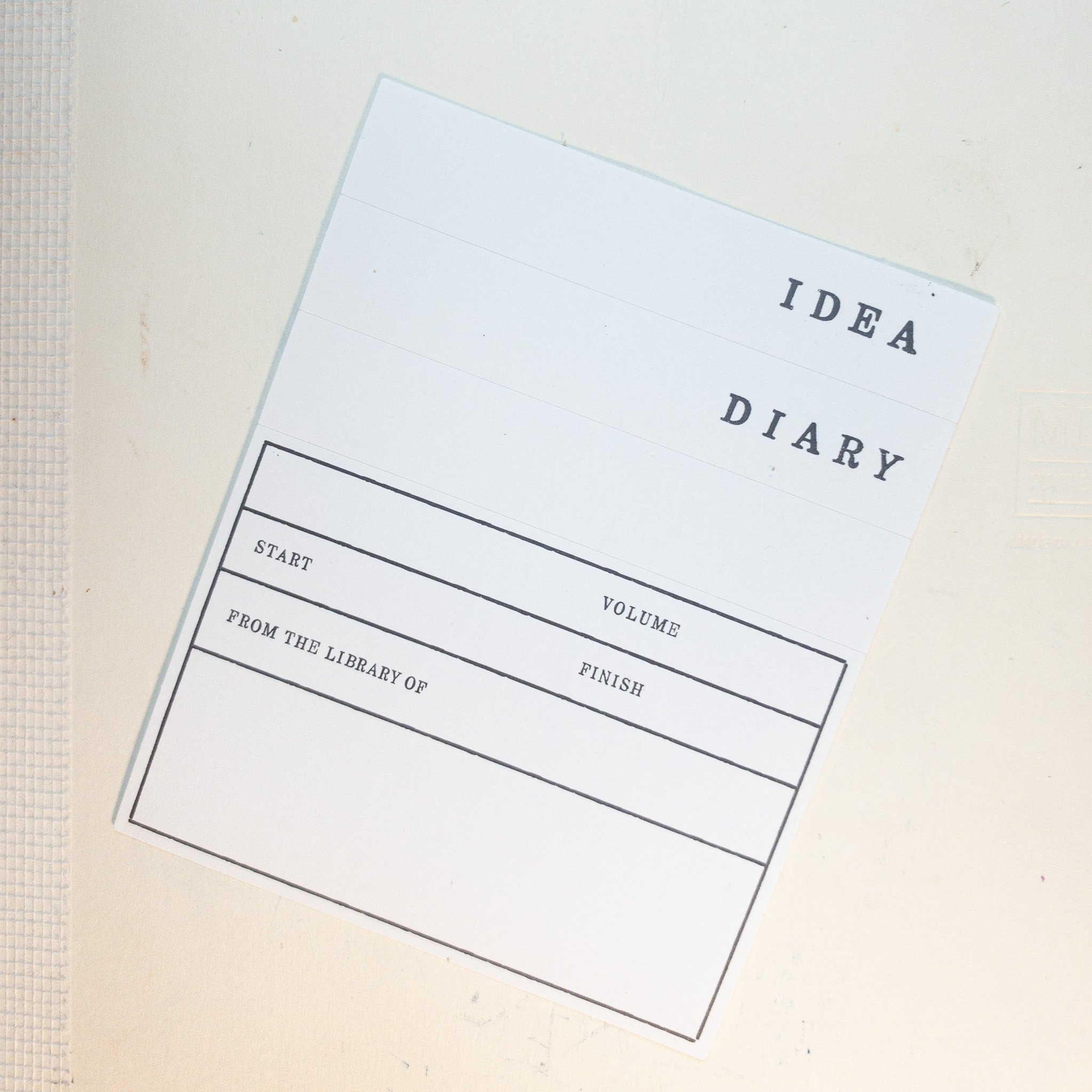
Included with the Notebook is three index tabs (“Idea”, “Diary” and a bank one) as well as larger sticker offering more details about the book, especially if it is but on notebook of many and when you start and finish it.
The binding of this book is similar to an unfinished book and that gives it a very efficient aesthetic to it. In this binding the mull (the string thatched fabric - Midori uses the alternative term “super”) is glued over the top of the case rather than underneath and over the book signatures (Midori uses the alternative term “quire”). On top of that is the bookmark that is very well glued on the outside of the mull. Everything feels strong so this ‘incomplete’ binding doesn’t seem to offer any negatives physically. The reason given for this, which makes perfect practical sense, is so that the book opens easier and lays flatter.
The binding has eleven book signatures with eight leaves in each which gives us the 176 pages this book contains. The binding is tight and the each signature has a twelve-hole threaded binding.
The book, pictured at the bottom above with a Hobonichi Cousin in the middle and a Nanami Seven Seas Crossfield at the top. While the other two are thicker, with the 52gsm Tomoe River paper they have more total pages (480 with the Seven Seas). The paper in this Midori MD Notebook is a thicker 80gsm.
The book does a really excellent job of laying flat. When opened near the centre it is dead flat; when opened with a bias to one side it is still very flat. These are some of the best notebooks I’ve used for this. Midori credits the simple bookbinding design.
Paper
As mentioned the paper is a moderately textured paper (even though Midori describes it as “rough-textured” - I think this is wrong as there are much more highly textures papers out there). This does give it a very pleasant texture to it, enough to feel the paper without being distracting (or catching on an Extra Fine nib!). The paper is a yellow coloured paper. It’s not the yellowest out there but it isn’t just ‘off white’ like Tomoe River is and is far from the almost pure white of Clairefontaine paper. It is warm enough in colour to potentially warm up the colours of some inks (particularly the low saturation inks). For me this means that the paper isn’t a neutral paper colour as it does effect inks a little. If this is potentially an issue for you then Midori also offer a more expensive alternative (though with an extra 24 pages as well) with a cotton-paper notebook (mentioned above). This cotton paper (which I will probably review soon in its notepad version) is much more white (though still slightly off white).
As we move into the paper section showing off how the ink performs with fountain pen ink I’d like to draw attention to the following previous paper or notebook reviews I’ve done to compare with this Midori MD Paper Notebook:


Nib, Pen and Ink details
I used either Lamy Safaris. Lamy Vistas, Lamy AL-Stars, a Lamy Joy or a Lamy Studio for these reviews (I can’t remember which exactly) and seven different stainless steel Lamy nibs on that pen. The choice of pen (be that Safari, AL-Star, Vista, Joy or Studio) will have little impact in the writing performance. I will not use a Lamy Dialog because there is the rare chance of the nib drying out slightly which might affect the writing performance.
Lamy 1.9 Stub: this is a very wet nib
Lamy 1.5 Stub: this nib is moderately wet to write with (this is used for the brand and ink name title);
Lamy 1.1 Stub: this nib is on the drier side;
Lamy Broad: this is a wet;
Lamy Medium: this is a very wet nib;
Lamy Fine: this nib is moderately dry; and
Lamy Extra Fine: this nib is moderately wet.
The inks used in this comparison and the general characteristics are:
Lamy Crystal Ink: This ink is high saturation wet ink that presents with a moderate amount of sheen;
Robert Oster Bondi Blue: This ink is a moderate saturation and moderately wet ink with good lubrication that presents with a low moderate amount of sheen that occurs at the edge of where the ink pools and can show with various degrees of saturation. It can present with decent shading in the right conditions;
Montblanc Irish Green: This is a drier ink with low moderate saturation that can show with good shading and generally no sheen (apart from on the swatch);
Bungubox Omotesando Blue: Is a moderate sheen Sailor ink with little shading that is quite dark and moderately saturated that is very wet and can show dual sheen;
Noodler’s Pushkin: is a poor performing ink. It nearly always feathers and bleeds and displays as quite faded and splotchy; and
Diamine Skull & Roses: Is a super sheening wet ink with limited shading and high saturation.
These inks were chosen because they offer a variety of different characteristics from dryer inks to wet inks, from flat inks to shading inks, from sheen to no sheen and from high performance quality to low. These inks also come from a variety of manufacturers as well as different regions.
Lamy Crystal Azurite presents with a rich dark colour that leans a more blue than purple. It shows a strong golden-green sheen (almost bicolour) on the swatch but more limited and subtle sheen on the writing. The shading is smooth, frequent and very low contrast and there is no halo.
No feathering, spread, or bleeding.
Robert Oster Bondi Blue is more saturated than can be shown here to limitations on colour spaces in the cyan colour spectrum. It has some red edge-sheen on the swatch which is very subtle on the written line and only really in the more saturated parts. Shading has some high contrast and frequency with a sudden gradient but the dark shaded areas dominate. There is some limited haloing.
No feathering, spread, or bleeding.
Montblanc Irish Green is a little washed on in the base colour but gets very dark in the saturated part of the swatch and the wetter nibs. This translates to a decent contrast in the shading with a fairly sudden gradient but it is still rather infrequent. There is a subtle halo. The sheen is a subtle dull pink sheen but it doesn’t really show on the written line much (apart from a couple of very wet letters).
No feathering, spread, or bleeding.
Bungubox Omotesando Blue is a fairly rich blue on Midori MD paper but not very rich. It leans a little more purple than it does teal. The ink is fairly flat and doesn’t produce much shading. What shading is there is an OK contrast but is a smooth gradient and low frequency. The sheen is mostly a slightly full red but there is some silvery gold-green sheen (with low saturation) in parts of the swatch. The sheen on the swatch is quite low and only shows the full red.
No feathering, spread, or bleeding.
Noodler’s Pushkin often performs quite poorly with a patchy look to it and with feathering, bleeding and spread being common. It isn’t the worst ink I have ever used but it is probably one of the poorer performing inks that a user might reasonably run into.
Noodler’s presents fairly washed out teal leaning blue. It is low saturation and not very dark. It dries quite sickly and soaks into the paper. However this paper does resist this ink quite well but not perfectly. There is no sheen and shading is very limited.
There is bleeding, feathering and spread. More on the bleeding later but the feathering only really shows where one line crosses another (for example at the bottom right part of the capital N in ‘Noodler’s’. This isn’t terrible and it actually does a decent job but it is still there.
Diamine Skull & Roses is a practical super sheening ink. It isn’t quite as extreme as Organics Studio Nitrogen Royal Blue but it is a little more practical because of that. The ink presents as a very rich blue that leans a little more to the teal side of the blue spectrum. The shading is decent with moderate frequency but sudden gradients and high contrast (the high contrast exaggerated by the sheen). The sheen is a very strong bright red that shows wrongly on most of the written line from each nib. The sheen sometimes makes it look like there is a halo but the ink (as distinct from the sheen) doesn’t create a halo.
No feathering, spread, or bleeding.
Top to bottom: Noodler’s Pushkin, Montblanc Irish Green, Robert Oster Bondi Blue, Lamy Crystal Azurite
Top to bottom: Bungubox Omotesando Blue, Diamine Skull and Roses
There is some ghosting in the swatch from all the inks apart from Bungubox Omotesando Blue. Montblanc Irish Green has very limited ghosting on the swatch. Diamine Skull and Roses is pretty low as well with Lamy Crystal Azurite and Robert Oster Bondi Blue showing similar Ghosting in the swatch. Noodler’s Pushkin moves past ghosting in the swatch with some true bleed-through. The writing in the wet Broad and Medium nibs bleeds through to the page on the other side of the leaf fairly strongly with weaker bleeding still happening in parts of the rest of the nibs. The swatch was the only part that bled through and contaminated the next leaf. This means that the paper doesn’t quite handle Pushkin as well as Tomoe River (52gsm ro 68gsm) but still isn’t bad. You should no judge this paper off this ink, however! Most papers fail with this ink. This is the ink’s fault, not the paper!
I think this is a great little kit of items and they all work really nicely together. The Fountain Pen is light and easy to use with a great nib. It might not feel like a premium fountain pen but it does its just very well and has a very appreciable aesthetic. I am genuinely impressed with this simple pen. It would work excellently as a beginner pen but its still something I like to cary with me at times. I’m a big fan of Midori paper so this notebook is easily something I would recommend. It has a very pleasant feel to it and presents inks well and handled poor performing inks decently. The cover is fun, simple, affordable and protects the Notepad. It isn’t mandatory but it is a nice addendum and rounds out the kit nicely.
The Midori MD Fountain Pen is AU$58 (US$42.70) which puts it nicely in the beginner fountain pen area with the set of cartridges being AU$9.95). The Lined A5 Midori MD Notebook is excellently priced at AU$18.95 (US$13.95). Of the three main items, the Paper Notebook Cover stands out as the least affordable at AU$19.95 (US$14.69) which is above the Notebook itself, but this is an item that is intended to be used across multiple notebooks so this item is not a single use item. As a set this gives you a great pen, notebook and cover combo for less that AU$100 (which would include free shipping within Australia from Ink’d Pens).
Thanks heaps to Ink’d Pens for sending this Midori MD Fountain Pen (and set of cartridges), Paper Notebook Cover, and Lined A5 Midori MD Notebook in for review!
✒︎ ✑ ✒︎ ✑
Thanks for reading! If you have any questions, comments or suggestions please let me know in a via the comments, Instagram, or contact me directly.
You can find my ink collection here and my pen collection here. Is there something you’d like reviewed? Let me know!
For blog updated you can follow @macchiato_man on Twitter, subscribe via email, or like my Facebook page. Check out the sponsors of this blog as well!
I was not compensated for this review and everything here is my own honest opinion. There are no affiliate links in this review. I was sent these items for the purpose of an honest review. Ink’d Pens does sponsor the blog (although during the pandemic I have suspended any payments).
Today is a review of a set of items from Midori that work quite nicely together. These aren’t an official set but I think they could easily be and would be great to buy together. They are the Midori MD Fountain Pen, the Midori MD Lined A5 Notebook with the Paper Notebook Cover. These are affordable products from an established Japanese brand that have a certain minimalist-like aesthetic about them.
A big thanks to Ink’d Pens for sending these in for review!