

Taccia have a series of inks based on Japanese Ukiyo-e artists and selections of their works. The first two series are based on four works from Hukusai Katsushika which are predominantly landscape works and the other series is on four works from Sharaku Tōshūsai which are portrait works. The inks take inspiration from specific colours in each of the works.
Taccia has now released two more sets and the themes are the same, but the muse is different. The new eight-ink set can be split into the landscape works of Hiroshige (this review) and the portrait works of Kitagawa Utamaro.
Thanks to Desk Bandit for generously providing samples of 16 of these inks.

Images of the artwork of Hiroshige I found online
Hiroshige was born 37 years after Hokusai but you can definitely see the influence. Hiroshige has many artworks with Mt. Fuji looming in the background which clearly harken to Hokusai’s Thirty-six Views of Mount Fuji. Hiroshige’s landscape works seem more detailed and complex with more depth to the composition as well.
Ukiyo-e prints are woodblock prints where a publisher commissions, and promotes a work from an artist which is then carved into wood by woodworkers, and pressed onto paper by printers. This printing process, and the possibilities for variation at the printing end of the process explains why there are different images of the artworks available with some different colours as well.
Ukiyo-e means “picture of the floating world” and was often used to depict indulgent entertainments of various standards.
Taccia describe the inks as follows:
“The Ukiyo-e is a Japanese printing established in the Edo-period(17th century) to feature the life style, trend and play by the people of the time.
Those colors used for Ukiyo-e are too delicate to be expressed in a single word.
Our product Ukiyo-e ink reproduce these colors and will expand your enjoyment of drawing with fountain pens.
All inks are made of safe raw materials and all colors were supervised by the color consultant in Japan.
These ink collections were also produced by the stationery expert and manufactured by our factory.”
The Hiroshige set of four inks are all cool colours. Again, lacking from all 16 inks is an ink you could comfortably call a green (or subset thereof). The colours are fairly consistent on Rhodia and Tomoe River.
Hiroshige – "58 (52) Sudden Shower over Shin-Ōhashi bridge and Atake"
The first ink in the set, Ainezu, is based on “Sudden Shower over Shin-Ōhashi bridge and Atake". The ink takes its colour from the dreary stormy weather.
Minireview on 52gsm Ivory Tomoe River (Old paper)
Ainezu is a soft moderately dark/light grey that has a strong blue-teal colour cast. The ink is decently wet and smooth with no feathering of bleeding. Dry time is moderate on Tomoe River and the water resistance isn’t bad at all.
Maruzen Athena Hatobanezu Grey is darker and less saturated. Diamine Early Grey, probably the closest, is less green but otherwise fairly similar. Silver fox has some of the green but that’s it and is much less saturated and is lighter.
Sheen
Shading

The coppery gold sheen is fairly week but still present in the writing on Tomoe River. It’s a subtle sheen, and that’s nice. The Shading is quite nice but not the strongest. There’s decent enough quantity of shading and a smooth gradient but the contrast isn’t super high. There is subtle haloing.

Sheen Comparison
Only Maruzen Athena Hatobanezu has comparable bu more sheen with the rest of the inks have negligible sheen.
Minireview on 80gsm White Rhodia
On Rhodia the Ainezu is darker but otherwise fairly similar. The water resistance seems to have washed more away over the full grid but is overall similarly resistant. Dry time is only one step quicker than Tomoe River, but still fairly moderate. No feathering or bleeding!
The Chromatography is a simple grey-blue colour (similar to the ink colour) that ends with a thin dark grey before ending fulling with a very pale blue.
Maruzen Athena Hatobanezu has slightly more visible blue but is still too dark; on Rhodia this is probably the closest as Diamine Early Grey is more purple leaning now, less saturated and too dark. Diamine Silver Fox is a little more strongly saturated but still to light and not blue.
Sheen
Shading


There is essentially no sheen on Rhodia and the shading bares the same characteristics as on Rhodia but the contrast is now higher.
Sheen Comparison
Only Silver Fox presents the barest hint of sheen and it’s still negligible.
Hiroshige – “75 The Dyers' Quarter in Kanda”
Asahanada gets it’s light dust blue colour from the dying fabric in the foreground of the composition of “The Dyers' Quarter in Kanda”.
Minireview on 52gsm Ivory Tomoe River (Old paper)
The ink is is a light pale pastel blue that is low-to-moderate saturation giving it a bit of a grey look. The ink is moderately wet and the driest of this set of four inks but certainly not a dry ink.
Water resistance is decent for a light ink! Surprising. The dry time isn’t the quickest but isn’t too bad for on Tomoe River.
Sailor Ink Studio 140 is one of the dual-colour inks but the blue part of it isn’t too far off. It’s definitely less green and more saturated, however. Montblanc Miles Davis is too light and not green enough. Ishida Bungu (Sailor) Hachimanzaka Blue is a touch darker and also too blue and saturated. Difficult to pick here but maybe 140?
Sheen
Shading


There is essentially no sheen on Tomoe River in the writing (though if you look very closely you can some). There is some copper sheen on the swatch. There is a very noticeable amount of haloing (well, noticeable for haloing which is a subtle characteristic). I always appreciate a good halo!
Shading is nice with some decent contrast, a smooth gradient and decent consistency.
Sheen Comparison
Only Ishida Bungu presents with any sheen and even then it’s practically non-existent there. Montblanc Miles Davis has some nice haloing as well!
Minireview on 80gsm White Rhodia
On Rhodia, Asahanada is a little darker again and possibly a little lass saturated. Dry time is moderate for Rhodia and the water resistance seems not quite as good as on Tomoe River, surprisingly. Still OK though.
The chromatography of Asahanada is a light pastel-grey blue (essentially the ink’s colour) ending with a very pale green and completing ending with a very pale blue.
Montblanc Miles Davis, on Rhodia, is the clear winner. It’s a little bit green leaning (though not enough) and is comparable lacking in saturation and darkness. Ishida Bungu and 140 are both too saturated and too dark.
Sheen
Shading


Absolutely no sheen at all.
The Shading is very similar as on Tomoe River but the gradients are shorter and the contrast is higher. The haloing is present but less noticeable.
Sheen Comparison
Miles Davis again has comparable haloing with the rest of the inks showing no sheen at all.
Hiroshige – “65 (57) Inside Kameido Tenjin Shrine”
Nakamurasaki is based of the hanging wisteria in the foreground, in front go a round bridge in “Inside Kameido Tenjin Shrine”.
Minireview on 52gsm Ivory Tomoe River (Old paper)
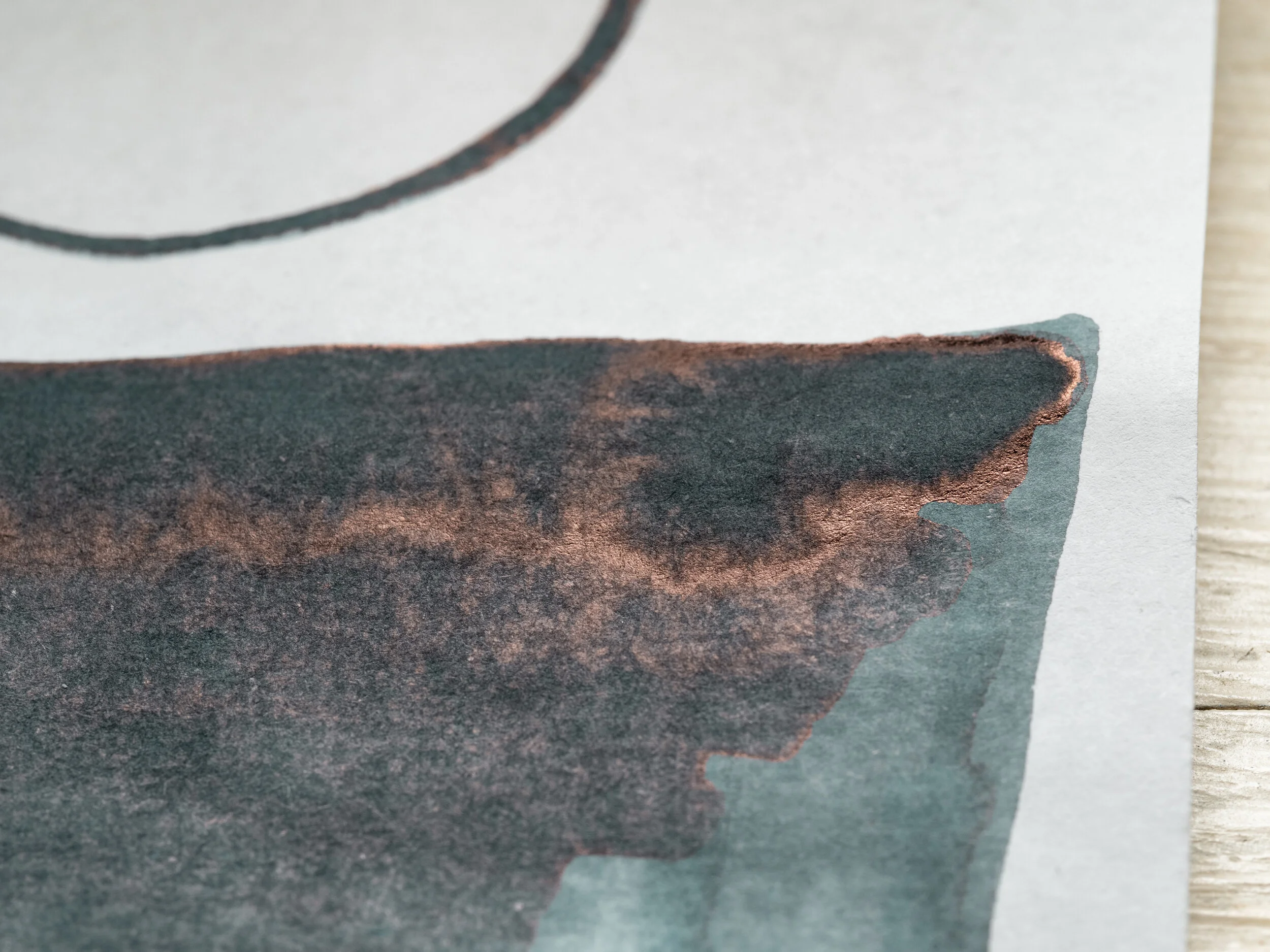
The theme of this set, apart from being cooler coloured, is also a greyer complexion (Ruri notwithstanding). Nakamurasaki is a greying lilac colour. Encolorpedia shows Chinese violet French lilac Wisteria purple. It is another moderately wet and smooth ink but slightly more so than Asahanada. There is no bleeding or feathering.
The water resistance is pretty poor to non-existent. Dry time is decently moderate on Tomoe River.
Sailor Ink Studio 453 is too dark and saturated but a comparable hue. Caran d’Ache Ultra Violet is looking decidedly burgundy on Tomoe River. Franklin-Christoph Tenebris Purpuratum is a little more red leaning and less saturated but probably the closest of the three.
Sheen
Shading

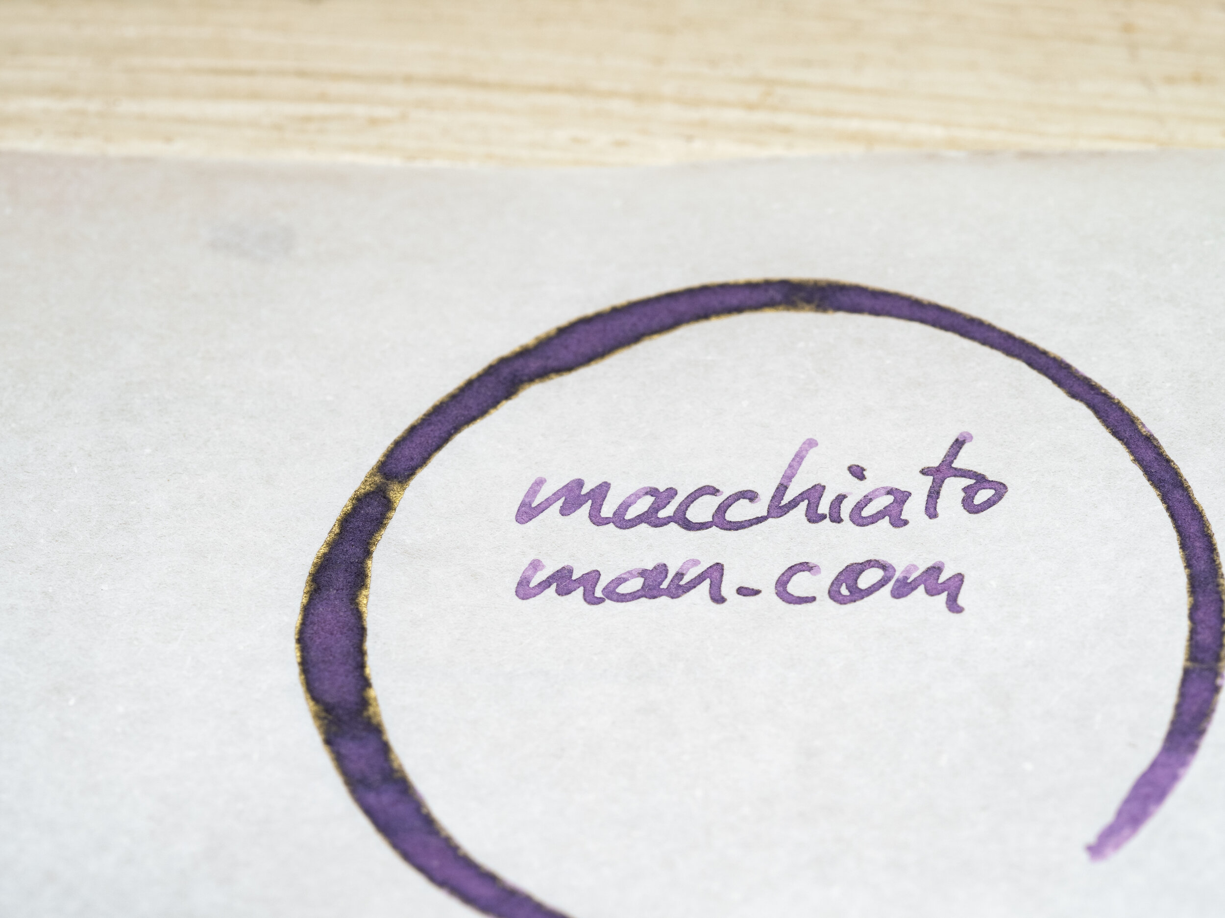
There is some green-gold sheen on the swatch but none in the writing. Shading is frequent on, surprisingly, the wetter writing nibs with high contrast and almost no gradient. The shading is softer on finer nibs but still there! There is a little haloing.
Sheen Comparison
453 presents with a similar sheen (also only on the swatch). Ultra Violet has a dull grey-gold sheen on the swatch only and Tenebris Purpuratum has a tiny copper sheen also only on the swatch.
Minireview on 80gsm White Rhodia
Consistently, the ink is darker on Rhodia again but the colour hasn’t really changed. Dry time is again decently moderate and the water resistance is again close to not there.
The chromatography is much more colourful than the ink with a bright fuchsia ending a little darker before a light green and then a saturated light blue to end it all.
Ink Studio 453 is too dark but has taken a hit with saturation on Rhodia and is now the closest of the inks. Ultra Violet is a little bluer but not enough. Tenebris Purpuratum is now much too red.
Sheen
Shading
No sheen anywhere on Rhodia. The shading is a little stronger than on Tomoe River, especially with the dryer writing nibs. A strong shading ink is Nakamurasaki! The halo is too subtle this time though.
Sheen Comparison
No sheen on any of these!
Hiroshige – “Nihonbashi. Clearing After Snow”
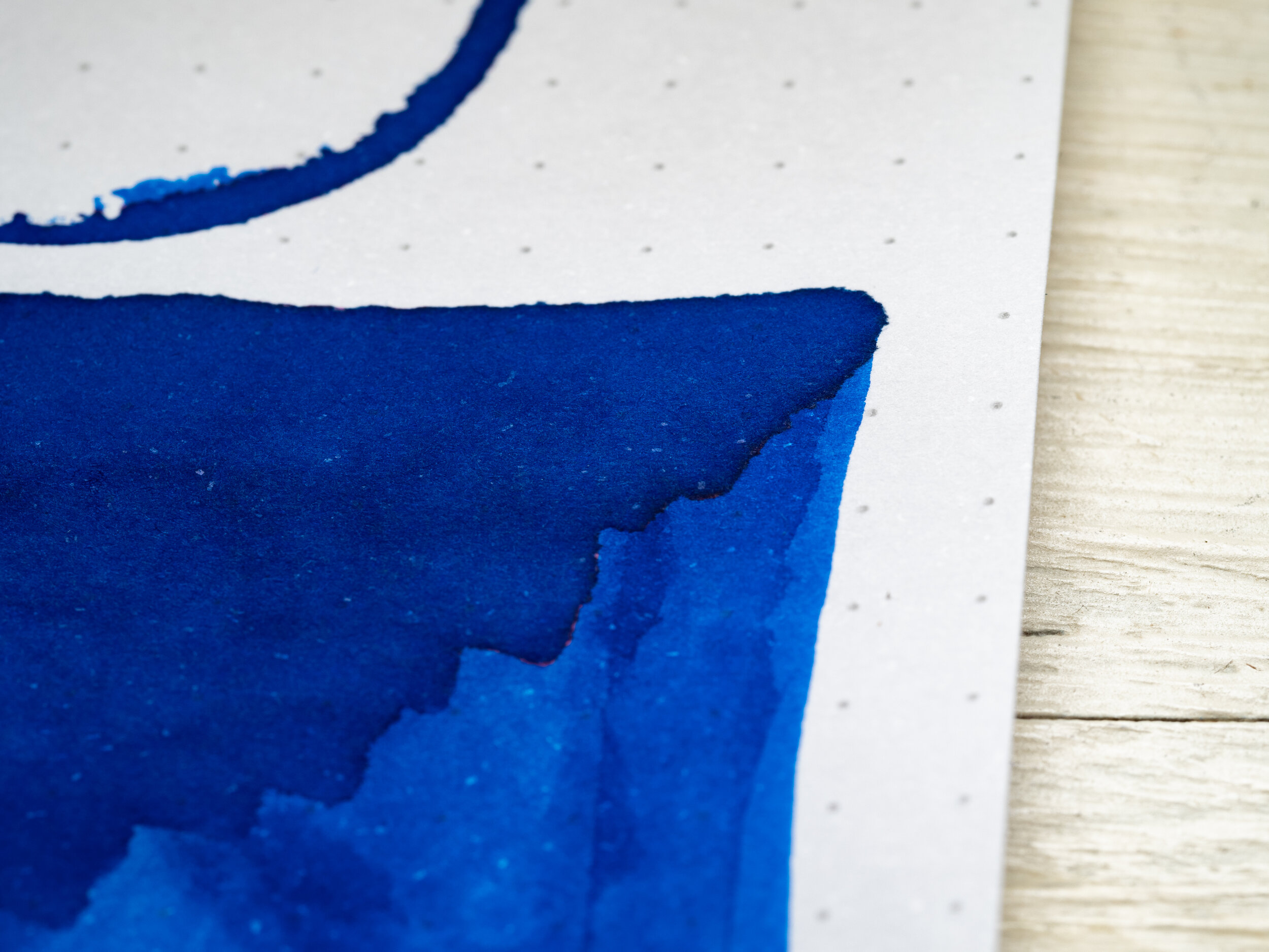
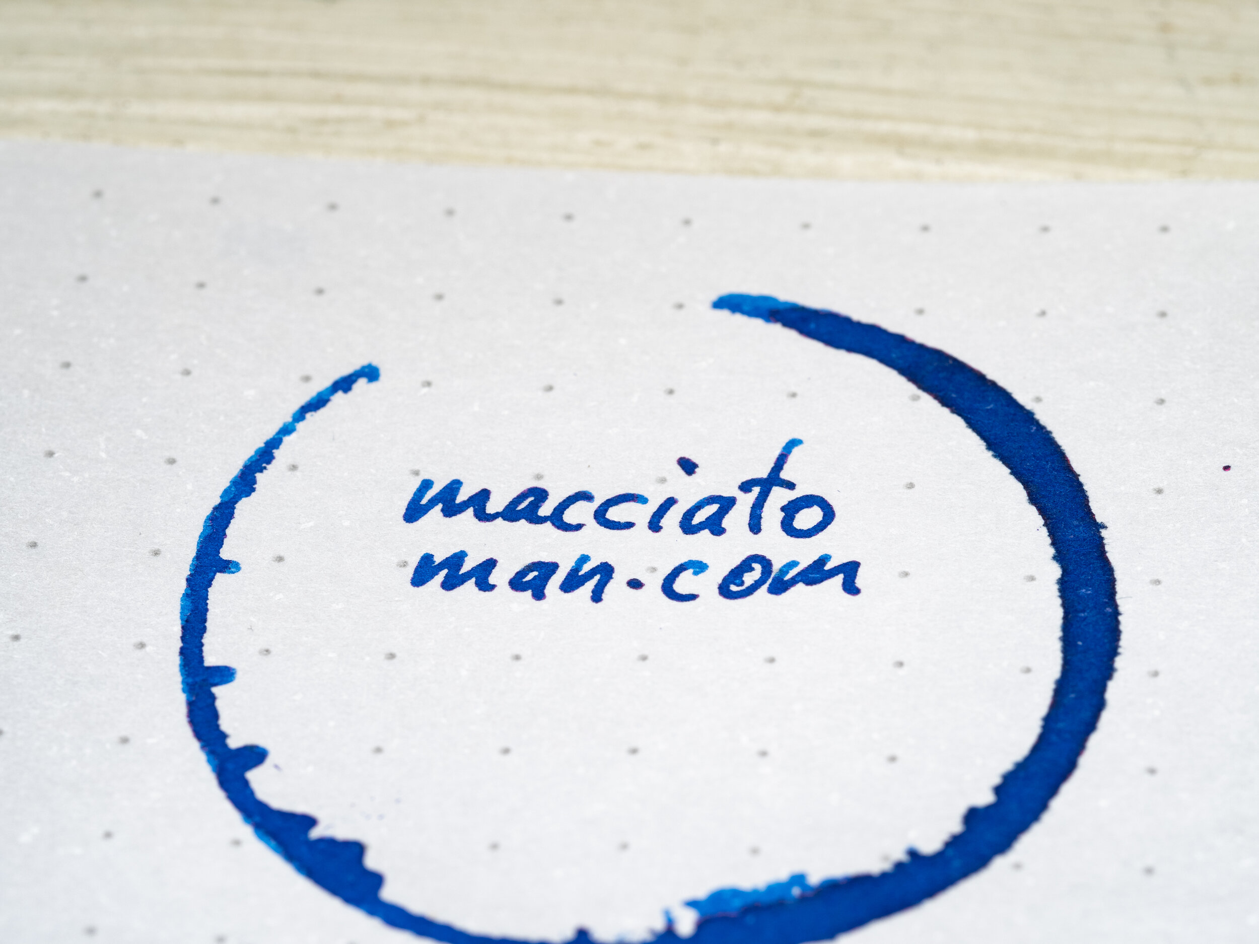
Ruri gets its colour from the rich water in “Nihonbashi. Clearing After Snow”. Nihonbashi certainly looks different from when I was there in 2018!
Minireview on 52gsm Ivory Tomoe River (Old paper)
Both of these two newest sets of four inks have one standout high saturation ink. The ink is extremely wet; a gusher! With the Hiroshige set it is Ruri. Ruri is a very high saturation neutral blue and neutrally dark ink. It looks very rich.
The ink leaves the barest pink lined behind but essentially there is no water resistance. Dry time is is moderate for Tomoe River which is a surprise given how wet it is.
Kobe #37 Island Blue is too dark and purple leaning. Diamine Maureen is a similar colour, if too green leaning. Akkerman Shocking Blue/Diamine Majestic Blue is darker and a touch less saturated but a comparable hue. I think Maureen would be the closest here.
Sheen
Shading


The sheen is a brilliant red that leans slightly copper. It is present pretty much everywhere but isn’t quite a super sheener - not far off though! The shading isn’t that strong. On occasions where there is some sheen it has some decent contrast but there just isn’t that much on Tomoe River.
Sheen Comparison
Kobe #37 has a subtle silver-pink sheen and a subtle silver green sheen which aren’t that similar to the rich coppery-red sheen of Ruri. Diamine Maureen’s sheen is stronger and more pink-magenta than copper-red. Akkerman Shocking Blue/Diamine Majestic Blue is a similar colour but stronger as well.
Minireview on 80gsm White Rhodia
On Rhodia the ink seems a little less saturated because it is missing the sheen (and it is very slightly less saturated)! It’s also not darker on Rhodia, if anything it’s a touch lighter. Water resistance is a touch better than on Tomoe River but I still wouldn’t rely on it! Dry time is moderate as well - again not bad for a wet ink.
Chromatography starts with a pink-magenta that is replaced by a rich neutral blue before changing to a light blue that gets slightly darker before abruptly ending with a dark rich blue.
All the comparison inks are too dark. Kobe isn’t green enough, Maureen is a little too green and Shocking Blue/Majestic Blue is also a little too green and still less saturated. Probably I’d pick Maureen again!
Sheen
Shading
Essentially no sheen on Rhodia. If you look on a macro lens you can see some on the writing but no really. Shading is a bit better on Rhodia. Still no a high shading ink but it’s decent with the dryer nibs; rather abrupt too.
Sheen Comparison
Kobe presents with a very dull grey “sheen” on Rhodia (swatch only). Diamine Maureen has some sheen on the written line, as does the Akkerman which is again the closest.
Swatches of 52gsm Ivory Tomoe River (Old paper)

Swatches on 80gsm White Rhodia
The boxes for these inks are pretty large given the 40ml size of the ink and the correspondingly smaller bottle sizes. However, it shows off the artwork nicely so there isn’t too much to complain about! There’s a lovely aesthetic about all of these inks and packaging.
I understand there are lots of blue-leaning inks out there but at least there’s only one “true” blue in this set. I’m not normally a fan of colourful greys but I think Ainezu is colourful enough to become it’s own category outside of a simple grey. Asahanada has a nice subtle greyness to it as well while being a lovely legible lighter blue. I, personally, prefer my purples to be dark and rich but I don’t particularly like light purples that much so it being a bit grey and dusty works nicely for me!
Check out the overview of the first Ukiyo-e series based on Sharaku Tōshūsai here and Hokusai here with Utamaro here.
Thank you again to Desk Bandit for sending samples of these inks for review!
✒︎ ✑ ✒︎ ✑
I've listed all my inks and all my pens in their respective pages. Please let me know which inks you'd like to review next via the comments, Twitter, Instagram, or contact me directly.
For blog updated you can follow @macchiato_man on Twitter, subscribe via email, or like my Facebook page.
I received these stationery items free of charge for the purpose of giving an honest review. I was not otherwise compensated and everything here is my own honest opinion. There are no affiliate links. Nota bene: Desk Bandit are also a sponsor of this blog.