
Standard Bindery have now released their second set of inks for fountain pens. Their first set released by Standard Bindery, when they were named Bookbinders Online, was the eight Snake Inks (two blue, brown, green, orange, grey, black and red). The new formulation is something that Standard Bindering are pretty excited about and their most extensive project to date. The new set of six inks are Canyon Walk, Stargaze, Old Friend, Road Trip, Clear Water and Luna Tone.
Swatches on 52gsm Ivory (White) Tomoe River
I quite liked the Snake Inks from Standard Bindery (then Bookbinders Online) as there were some nice colours and some excellent packaging (it really matched the “snake oil” look they were going for). When Standard Bindery approached me to look at their new go at inks I was pretty excited to try them. I can’t imagine it’s easy to come to a decision as to what colour families and what colours you want in your set of six inks. The obvious but more boring blue, turquoise, blue-black, black, green, red? Plenty of companies have employed this approach (or similar) and I’m glad Standard Bindery have not gone down this road. Instead they’ve gone with saturated ochre, a green-tinted dark grey, a low-ish saturation old mauve, a refreshing but still a little dusty light apple green, a light vibrant cyan, and finally a dark low saturation charcoal blue-black. Apart from the blue-black there’s nothing conventional about these colours; the orange is more of an ochre, the ‘black’ is grey and leans green, the purple is dark, red and desaturated, the green has a little dustiness to it, and the turquoise is very light and greener. The selection of colours also works well together and they look to be a cohesive part of a set.

Swatches on 80gsm White Rhodia
The other interesting part of making new inks is how to name them? Do you go with more abstract poetic and evocative names (Bungubox L’Amana/Nostalgia/Mother), associative names (Colorverse, Golden Record/Gingko Tree), descriptive names (Cult Pens Deep Dark Blue/Brown/Red), or some sort of mixture? Standard Bindery have gone with mostly poetic and evocative with these names. Old Friend and Road Trip are clearly poetic names meant to evoke emotions. Canyon Walk, Stargaze, and Luna Tone are a mixture of poetic and associative and Clear Seas more associative. Certainly a nicer approach than Sailor’s 100 inks all being just a set of three numbers (though I understand why) and also more interesting than calling the inks something blander like ‘Canyon Orange”, “Apple Green” etc.. I like the thought put into the release.
The packaging and 60ml (2fl oz) bottle design is also still quite nice. It’s worth noting that the inks I have been sent have prototype packaging (the labels) and these are pictured in the full-page Tomoe River photos (and are labeled as such). The photos of bottles of the whole set are the correct labels (photos supplied by Standard Bindery). The packaging still shoes nostalgia for the old bottles of the past which I love (and also why I love Noodler’s bottles so much). The packaging is minimalistic but still evocative of designs around the early twentieth century. Also, at 60ml the bottles old a decent amount of ink with many inks going the other way (looking at you, Sailor!)
One of the issues of the Snake Ink series was that many of the inks were on the dry side. This doesn’t mean the inks were objectively bad at all but in my experience more people subjectively prefer wetter inks (myself included) and it was a complaint I heard about the inks. One thing Standard Bindery noted to me was that the new formulation here should result in a wetter writing experience. It’s good to see that they are listening to feedback from the community!
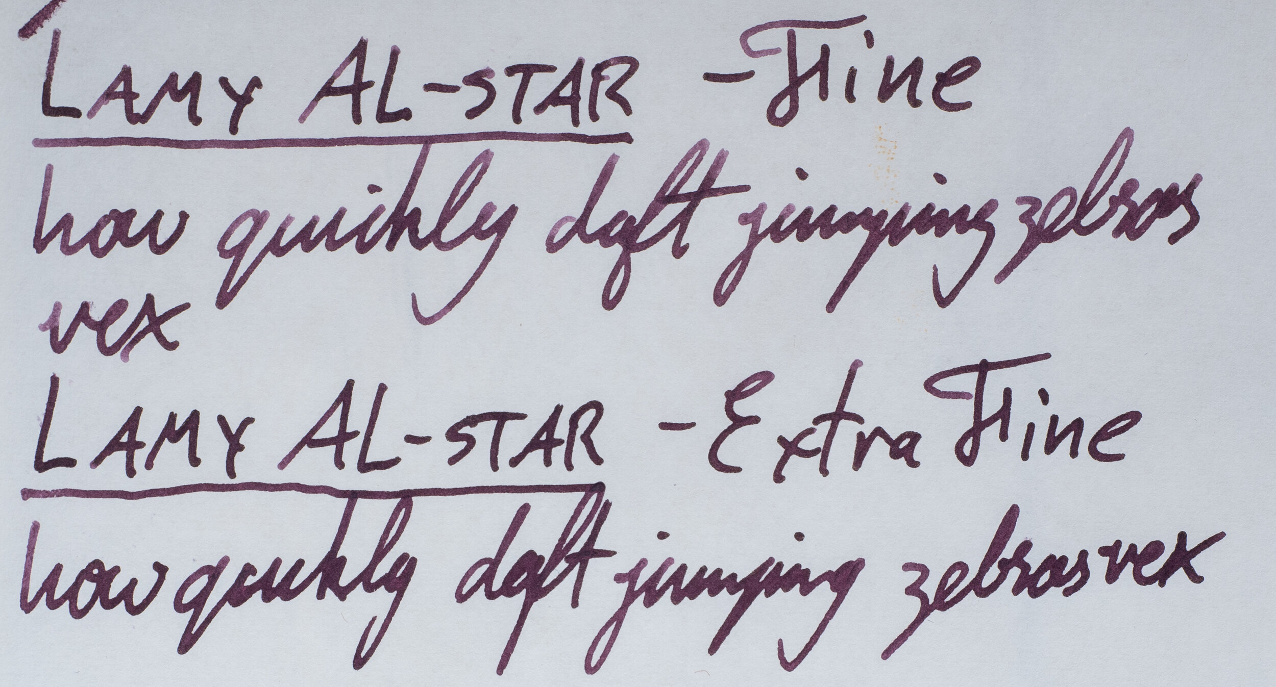
When writing the overviews (semi-reviews) for the inks I used a Lamy Al-Star with various nibs (1.5mm Stub, 1.1mm Stub, Broad, Medium, Fine, and Extra Fine). An approach I use (with fewer nibs) on my Instagram mini-reviews. These nibs have different writing characteristics apart from the obvious sizes and shapes: the 1.5 and the Extra-Fine nibs are neutral wetness, the Broad and especially the Medium are very wet nibs, and the Fine and 1.1 Stub are on the dryer side. It might be worth while keeping this in mind when looking at the images. I also inked each ink into another pen to just generally write with to see how it feels to me (these pens are pictured in the Tomoe River full-page photo).
On to the inks!

Canyon Walk Overview 52gsm Ivory (White) Tomoe River
Canyon Walk is a soft ochre colour with moderate wetness and lubrication (on the wetter side of moderate). The dry time is moderate for Tomoe River and there is no water resistance.


The shading on Canyon Walk is quite lovely with a decent amount of contrast and frequency to the shading.


Canyon Walk Chromatography
While there technically is some sheen on the swatch (dull silver-gold) this doesn't translate into any real-world sheen.
The Chromatography is interesting with a very low saturation purple moving to a gradient bright orange that finishes with yellow and then a thin line of magenta.
Canyon Walk Overview 80gsm White Rhodia
On Rhodia the ink presents darker and redder and less soft over all. The dry time is on the slow time for Rhodia paper and there is no water resistance.


Shading is a little more contrasty on Rhodia but is surprisingly less frequent (often Tomoe River flattens shading in inks).


There’s some strong halos in the swatch but no sheen. The halos to translate a little in the writing, however!
Stargaze Overview 52gsm Ivory (White) Tomoe River
Stargaze is a dark grey ink with a hint of green. It is is very nicely wet and lubricated to write with but still isn’t slow to dry! The water resistance isn’t strong but you can still read the faint lines left behind.


Shading is low contrast and only really present in the driest nib (the Fine). I like how this looks with shading though.


Stargaze Chromatography
This is one of the two or three inks in the set with sheen and it’s a nice copper sheen that’s strong on the swatch and quite noticeable on the written line giving this grey ink another nice level of complexity.
The Chromatography is a little interesting starting with a very low saturation blue-purple moving to a low saturation dark green and ending with a rich ocean blue.
Stargaze Overview 80gsm White Rhodia
On Rhodia the ink is again darker but otherwise fairly similar. The ink is decently quick to dry and the water doesn’t run as much but is otherwise the same a mount of water resistance that is present on Tomoe River.


Shading is still low contrast but is a little more frequent with some nice shading coming from the Extra Fine nib on Rhodia.


There’s some (mostly edge) sheen on the swatch and surprisingly there is some tiny amounts of sheen on the writing. Not much but its definitely there!
Old Friend Overview 52gsm Ivory (White) Tomoe River
Old Friend reminds me of a desaturated tyrian purple. The ink is fairly wet and lubricated to write with. It’s rich but still soft and dusty - to me it definitely feels old! The dry time is moderate for Tomoe River and the water resistance leaves some faint lines behind again.

This one isn’t a strong shader with only some subtle shading coming out of the dry Fine nib.


Old Friend Chromatography
Some low-saturation gold sheen is present in the swatch and (more subtly) in the wet writing. Definitely not a prominent sheen though.
The chromatography starts with a grey that moves to a mauve that slowly get more saturated before suddenly moving to a pink and then an azure.
Old Friend Overview 80gsm White Rhodia
On Rhodia Old Friend is darker (much darker where wetter) and less saturated. It almost looks like a faded version of the ink on Tomoe River. Writing with this ink feels a touch dryer on Rhodia paper. The dry time is rather quick on Rhodia and the water resistance is the same as Tomoe River (faint lines left behind).


Shading is much stronger on Rhodia (perhaps related to why it feels dryer) with some nice contrast and frequency (though still far from strong shading).


Absolutely no sheen present on Rhodia and almost no halo either.
Road Trip Overview 52gsm Ivory (White) Tomoe River
Road Trip come the closest to an ink from Standard Bindery’s first release of Snake Inks, Emerald Boa. I reviewed Emerald Boa pretty early on in this blog’s history so excuse the lower quality! Emerald Boa is brighter, more saturated and more of a pure green. Road Trip is lower saturation and with some dirtiness to the colour which, for me, makes it a more complex and more interesting ink. The ink is, along with Clear Seas, the two dryer inks from the set. I’d categorise them is moderate wetness. Dry time is pretty decent and there is absolutely no water resistance.


Shading is pretty frequent but the contrast isn’t too high unless the nib is on the wetter side allowing for some darkness in the shading. Overall a good shader.


Road Trip Chromatography
There’s no sheen on the swatch or writing but there’s a strong halo on the the swatch and the wet lines of writing which is always nice to see.
The chromatography is not too dissimilar to that of Emerald Boa except the blue is darker and stronger but smaller and the yellow is more of an orange here.
Road Trip Overview 80gsm White Rhodia
On Rhodia the ink is a little more saturated and darker (I’m sensing a trend). Dry time is lightning quick and no water resistance.


Contrast in the shading is up with some very strong and frequent shading. A very good shader!


Still no sheen but the halo, while still present, is much less visible on Rhodia.
Clear Seas Overview 52gsm Ivory (White) Tomoe River
Clear Seas is an interesting colour! It’s quite light and looks pale at first sight but is really still decently saturated. It’s also a rather green leaning turquoise-like ink colour. The ink is, along with Road Trip, the dryer of the set. Again just moderately dry and in a wetter pen there’s nothing to worry about. Dry time is surprisingly slow on Tomoe River for a dryer ink and there is absolutely no water resistance.


Shading is pretty frequent and consistent but is very low contrast due to the ink being so light as it is!


Clear Seas Chromatography
There’s a subtle amount of pink sheen on the swatch and the slightest hint of pink sheen on the wettest writing but practically there’s pretty much none here.
I find the chromatography really pretty and with an almost 90s aesthetic about it. A very soft pale blue moving to a very pale green before finishing with a more vibrant light blue. Lovely!
Clear Seas Overview 80gsm White Rhodia
On Rhodia it doesn’t really get much darker, a little maybe, but it does get a little more saturated and a little greener. Dry time is pretty moderate for Rhodia and still no water resistance as expected.


The contrast seems even less, surprisingly, with the shading on Rhodia compared with Tomoe River. The frequency is the same, decent, but it’s difficult to see.


No sheen present here on Rhodia but a subtle amount of halo in both the swatch and writing.
Luna Tone Overview 52gsm Ivory (White) Tomoe River
Luna Tone is the most conventional ink in the line up - a blue black. But it’s still an interesting blue black with low saturation and a hint of purple coming through. The ink is one of the wetter inks of the bunch and is well lubricated to write with. Dry time is moderate for Tomoe River and the water resistance is the best of the bunch with some strong lines still visible!


Little shading with Luna Tone on Tomoe River with only the driest nib really showing some low-contrast shading.


Luna Tone Chromatography
It’s the other ink of the set, with Stargaze, that shows strong sheen (Old Friend showing more subtle sheen). A lovely copper sheen that adds a bit of a pink hue to the ink making it seem even more purple than it is. Definitely stronger sheen on the wetter lines but still present on the dryer lines.
Chromatography is fairly boring! A low saturation purple-grey gradient getting darker ending in a low-ish saturation azure!
Luna Tone Overview 80gsm White Rhodia
The ink is even less saturated on on Rhodia looking like a steal grey here more than a blue black! The dry time is pretty decent on Rhodia and the water resistance is still good (but surprisingly better on Tomoe River).


The Shading is definitely better on Rhodia than on Tomoe River but the contrast is still low. The frequency has increased on the dry fine nib and there’s some shading on the 1.5 Stub as well.


The sheen takes a hit on Rhodia, as expected, with only a little visible on the swatch and only the tiniest of hints on the writing; practically none!
In my State of the Union I said I wanted “shading to be the theme of 2020” and “quality over quantity” and for many of the brands I was stressing uniqueness of the inks and a move away (slightly) from bright colours with super high sheen. I think Standard Bindery have done an admirable job selecting these colours of these inks and their characteristics. Many of them are decent shaders, a couple with nice sheen (without being supersheeners) and the colours are interesting and with some complexity. You can tell that Standard Bindery have put a lot of thought into choosing these inks, their colours and their characteristics and that’s exactly what I wanted from “quality over quantity”.
The new inks are (€13.44, US$14.8, £11.37) AU$21.95 inc. GST (Australia’s Sales Tax) which works out to AU36¢ per ml for people who like to know that stat (I don’t think it’s that meaningful of a metric). The prices are definitely decent and affordable which is always good to see. Standard Bindery are also looking for retailers to stock the inks so hopefully more will come to a store close to you!
I believe these inks are an excellent and well thought second foray into the world of inks and well worth checking out!
✒︎ ✑ ✒︎ ✑
I've listed all my inks and all my pens in their respective pages. Please let me know which inks you'd like to review next via the comments, Twitter, Instagram, or contact me directly.
For blog updated you can follow @macchiato_man on Twitter, subscribe via email, or like my Facebook page.
I received these stationery items free of charge for the purpose of giving an honest review. I was not otherwise compensated and everything here is my own honest opinion. There are no affiliate links. Nota bene: Standard Bindery are also a sponsor of this blog.