Released as part of a batch of seven inks (the others being Burned Orange, Crocodile Green, Deep Purple, Dragon’s Night, Hot Pink, and Red Candy) True Blue came out in the latter part of last year. I’m not sure whether it was a themed group release but many seven inks are some of my favourite Robert Oster inks and some of Rob’s more unique inks (especially within the Robert Oster lineup). While ‘True Blue’ has a history older than Australia it is a term that came into the Australian lexicon (and for her most part left it as well) that means, roughly ‘authentic’. It’s used an as adjective to to qualify how a person relates to a subject matter such as a ‘true blue ink enthusiast’ (I reckon that’s the first time that phrase has been said!)

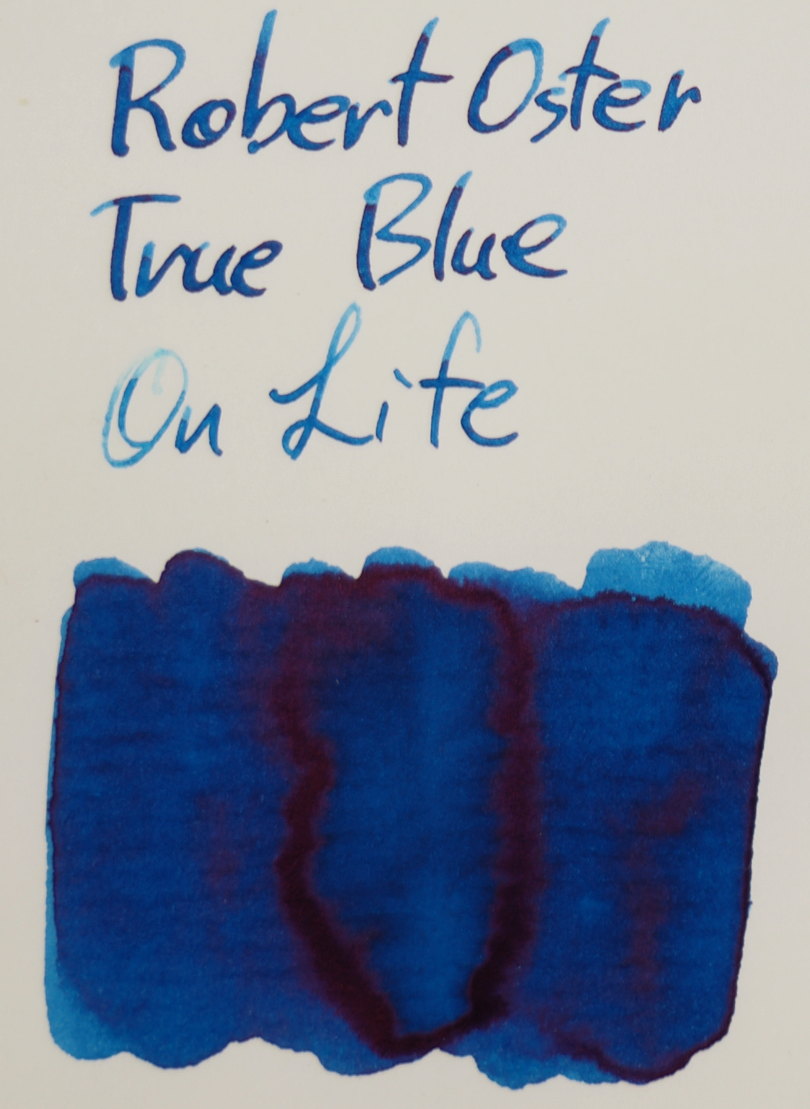
Robert Oster True Blue is green leaning neutrally shaded blue. It’s not really a light or dark blue. The ink colour is fairly consistent between papers with most changes being in shade with poorer quality papers often being lighter in colour (such as copy paper) and with some papers being rather dark (such as G. Lalo). It’s decently saturated but not highly.
The ink performs pretty well an all paper including pretty poor paper. There is some obvious spreading but the feathering is mostly contained. It’s not the prettiest ink on bad paper but it works fine. The ink is well lubricated and feels smooth coming out of even a dry nib.


The shading isn’t that strong with this ink. It’s a nice quality to the shading (good separation between the light and the dark) but there isn’t much of it. In the somewhat dry PenBBS 469 Fine nibbed pen there is noticeably more shading than in the rather we Montblanc 22.

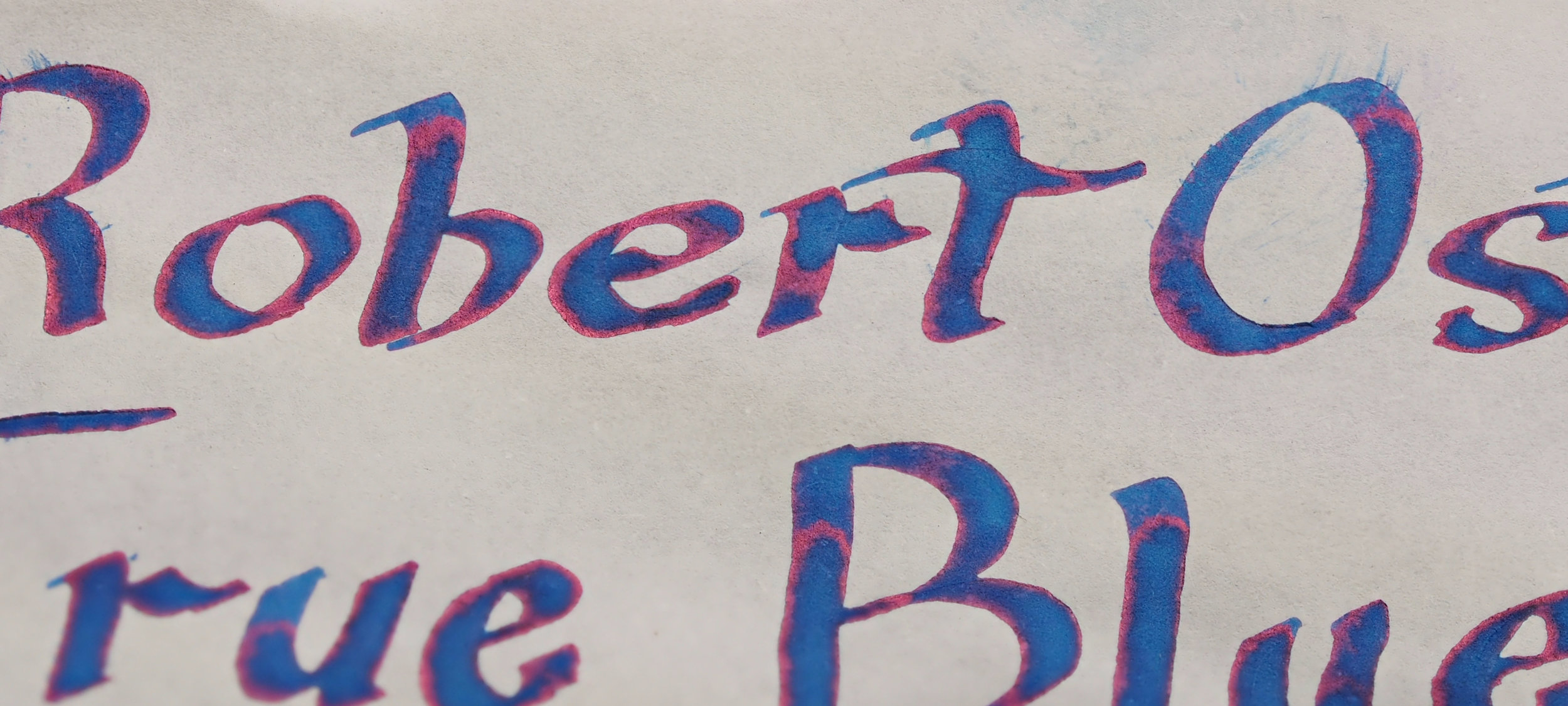

As with most if not all Robert Oster inks, the sheen forms at the edge of where the ink pools. Unlike many Sailor inks which cover the whole line or area where the ink has pooled, Robert Oster True Blue forms a border around that pooling to shine. It’s a pink-red sheen that’s pretty standard amongst these types of blue inks. It’s not a super strong sheen but it’s nicely visible on Tomoe River. On Rhodia it’s barely there, however.


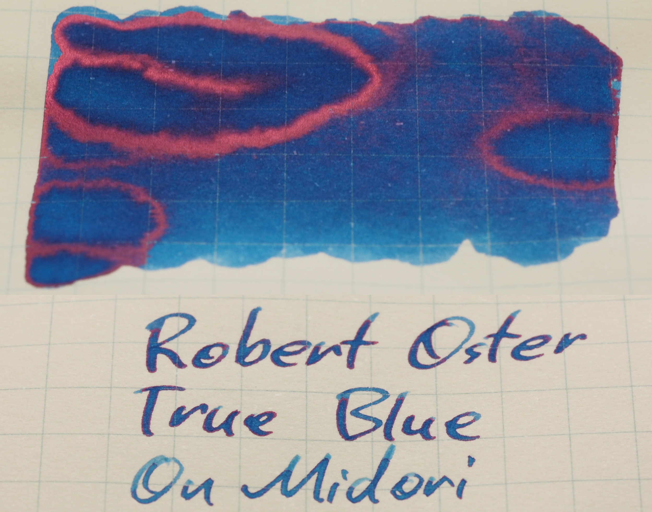
But while it’s barely there on Rhodia that doesn’t mean it isn’t visible on many papers. While Tomoe River has consistently prevalent sheen, Midori and Life paper and even Franklin-Christoph Firma-Flex show some decent sheen. You even get some on old Leuchtturm 1917 paper.


Chromatography is fairly uninteresting. There’s a moderate blue colour surrounded by a turquoise colour with the barest hint of some lavender-pink in the lighter areas.
Dry time is fairly standard. A little slower on Rhodia but within the margin of error, in my experience, and exactly what I consider normal for Tomoe River.
Water resistance is surprisingly quite decent! Water does wash some of the colour away but there’s a very visible line underneath.
Review on 80gsm White Rhodia
There quite a lot of contrast on Rhodia between the pens and also on the written line and the swatch. It’s generally a little darker here than on Tomoe River as well. The ink does feel a little greener here as well. There’s no smearing a day after drying, and the flow and lubrication only feels slightly less compared with Tomoe River.
Kobe #58 Hyogo Canal Blue: is darker and flatter but feels like a similar hue;
Parker Penman Sapphire: is a lot darker and less green leaning (which shows how green this ink does lean);
Sailor Gentle Souten: A hair darker and also a hair more saturated and a hair less green. It also feels a little flatter;
Montblanc BMW Blue: a touch greener but is a fairly similar hue and a similar shade (though a little lighter);
Monteverde Horizon Blue: Very similar to Parker Penman Sapphire (for me the best alternative to Parker Penman Sapphire out there). Noticeably darker and less green';
Kobe #17 Shioya Blue: Very similar but a hair darker. A little greyer, perhaps; and
Iroshizuku Kon-peki: More vibrant and also a little darker here.
My choice would be either Montblanc BMW Blue (which is probably not available any more so more accurately Robert Oster True Blue would be a decent alternative to Montblanc BMW, maybe), or Kobe #17 Shioya Blue.

Review on 52gsm Ivory/White Tomoe River
True Blue has less contract and is a little noticeably brighter. There is less green There is some smearing, unfortunately, but the lubrication and flow is quite nice.
Kobe #58 Hyogo Canal Blue: Is still a little darker but is much more saturated now;
Parker Penman Sapphire: Still darker and is still less green (but not as much as on Rhodia);
Sailor Gentle Souten: Very similar to canal blue this time though a little lighter than it. Darker and more vibrant than True Blue;
Montblanc BMW Blue: Noticeably lighter this time and still greener;
Monteverde Horizon Blue: Again very similar to Parker Penman Sapphire but perhaps a touch less dark;
Kobe #17 Shioya Blue: Very similar hue and shading to True Blue though still a little desaturated; and
Iroshizuku Kon-peki: more vibrant and saturated but a similar shade this time.
For Tomoe River I’d only pick Kobe #17 Shiyoya Blue. As below the sheen is different, but the shade and hue is fairly similar.


As mentioned above the sheen of Robert Oster inks (of which True Blue is no exception) is an edge sheen rather than a sheen that covers the whole line. This is most similar to Parker Penman Sapphire and Monteverde Horizon Blue as well as Montblanc BMW (though the sheen isn’t strong here). Irozhizuku Kon-peki somewhat sits in-between an edge sheen and a full line sheen whereas all the Sailor-made inks have sheen that covers the whole line though Kobe #17 Shioya Blue is stronger on the edge.

Robert Oster True Blue is a solid blue and it with good performance. It’s not the most unique colour out there but I only have inks that look similar so it’s still found a hue that’s different from most blues (at least). The sheen is nice and pretty but certainly not over the top.
My only issue with the ink is, if you look at the cap, it has a little ™ next to the name. I’m not a huge fan of Rob’s approach to trademarks and patents in much of his stuff (indeed there was also controversy around the patent of the Serendipity pen). While I do trust that he isn’t a patent or trademark troll, I think this approach sends the wrong message. Especially when it comes to very generic terms such as true blue which are basically cliched common phrases in Australia. I understand the desire to protect your branding but I personally don’t feel that comfortable with true blue being a trade mark. As you can see, with Australia, Robert Oster holds the registered trademarks of several names and phrases and most of these are perfectly logical and there’s nothing wrong with them but True Blue (and Bondi Blue) being trademarks simply don’t sit well with me. It’s worth noting that at the time of this review neither True Blue nor Bondi Blue have yet been accepted by IP Australia and are both still in the examination phase (even though the so these are not (yet) registered trademarks.
Al that said, it doesn’t take away from the fact that this is a solid neutral blue ink with decent saturation and performance with a great name.
I purchased this ink as a supplier (so at wholesale prices). I am no longer a supplier. This ink can be found in countless stores around the world. As always, photos of the ink on various papers are below.
✒︎ ✑ ✒︎ ✑
I've listed all my inks and all my pens in their respective pages. Please let me know which inks you'd like to review next via the comments, Twitter, Instagram, or contact me directly.
For blog updated you can follow @macchiato_man on Twitter, subscribe via email, or like my Facebook page.
I was not compensated for this review and everything here is my own honest opinion. There are no affiliate links in this review.