
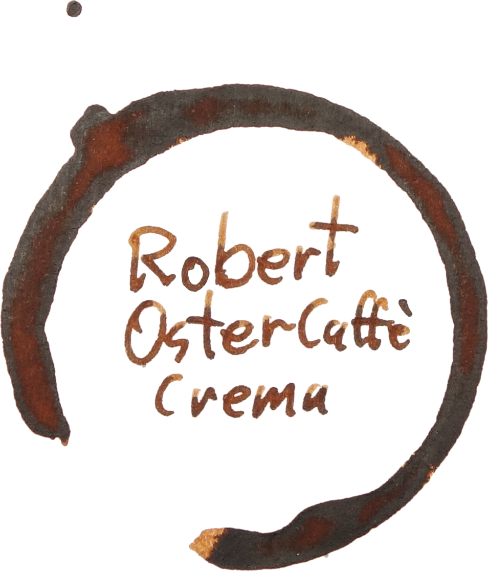
Robert Oster Caffè Crema is a relatively new ink that I knew I'd like the moment I saw an early-batch swatch of it. Lovely yellow brown that first reminded me of the crema of an espresso - the foamy layer that sits atop a freshly brewed espresso. I mentioned this to Rob and he came up with the name Caffè Crema which suites the colour nicely.
The ink can be bought from several stores around the world.

Caffè Crema has moderate saturation and vibrancy; it's not a dark ink and is a yellow, almost orange, brown. The ink has pretty impressive shading especially for an ink with decent flow and lubrication. The ink is on the wetter side and feels nice and smooth on paper. Unless the pen is putting down a wet line, there won't be much sheen on Rhodia or similar paper, but on Tomoe River the ink has a soft silvery sheen. The ink Halos very well with a wet pen and there is no bleeding or feathering. The ink fairs pretty well on cheap 80gsm copy paper but it does lose a lot of its character.
Interestingly, and I believe this is not uncommon for Robert Oster inks, Caffè Crema changes noticeably when left in the pen. In the photos bellow you can see that the sheen becomes slightly yellowy-green and the ink as a whole becomes darker and more intense. I think I prefer the ink when left in a pen but both are very nice.


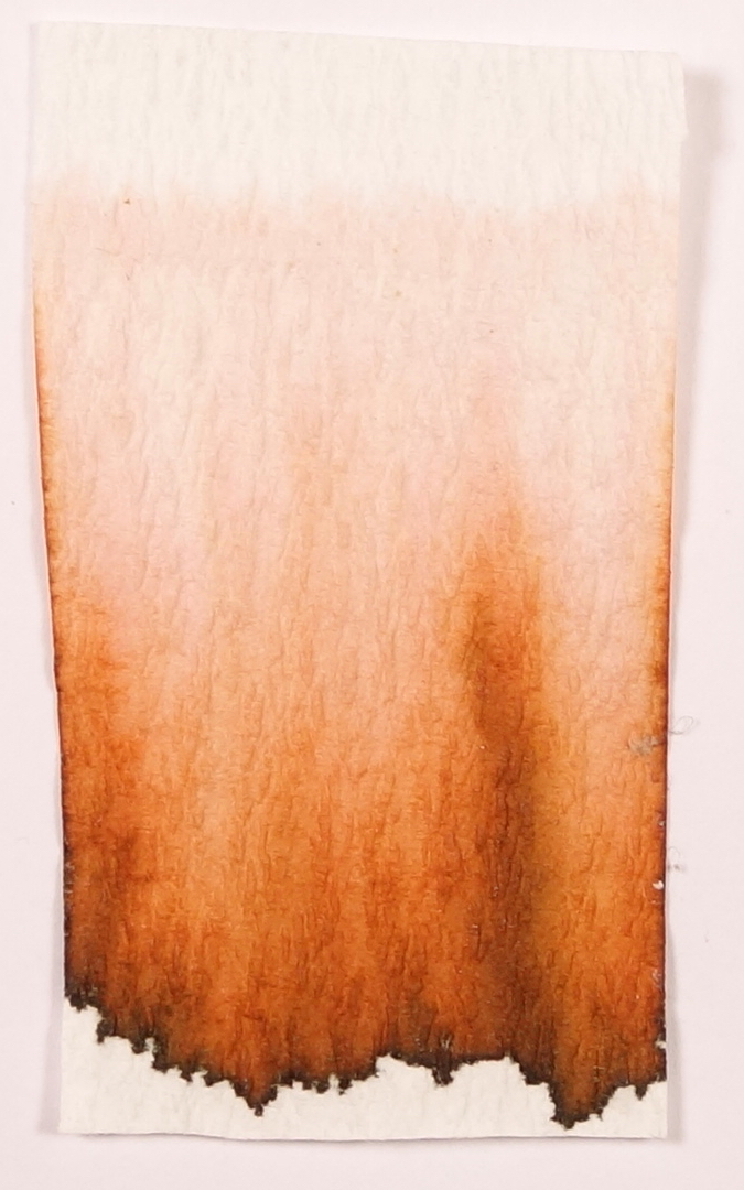

The ink takes a decent amount of time to dry but is quicker than some other Robert Oster inks I have tried and I would consider the dry-time to be moderate. The water resistance is also less than impressive, not that any resistance was expected. The ink washes away pretty extensively unless dabbed dry quickly but even then much of the line is gone.
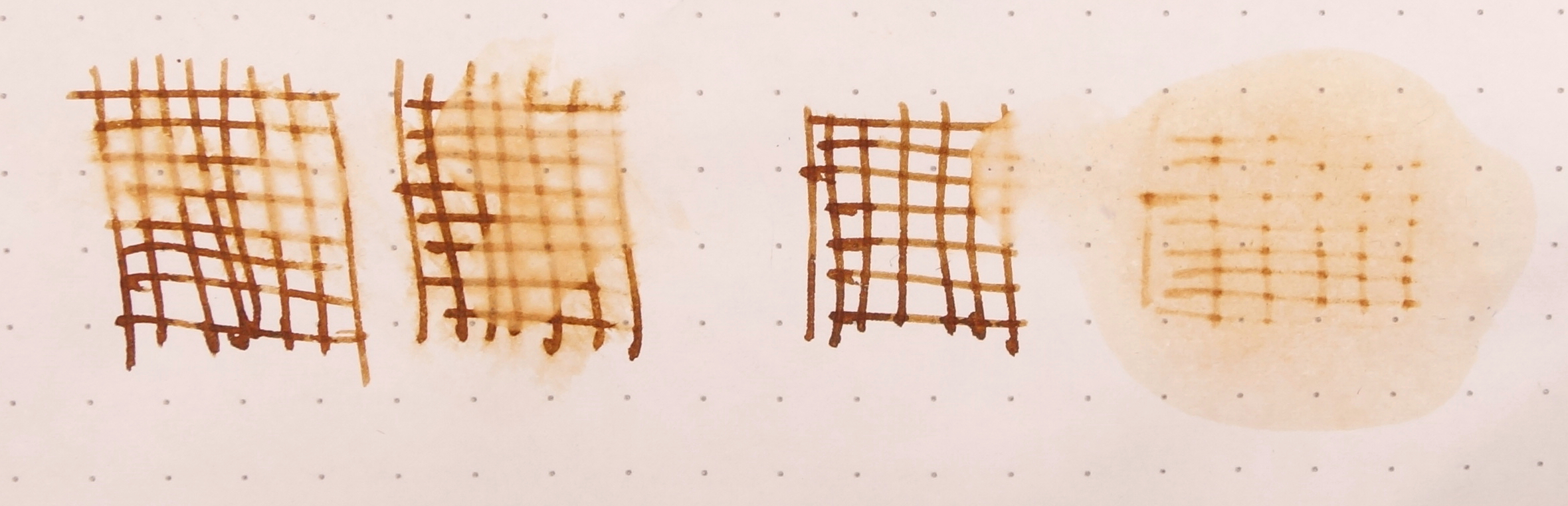
Top to bottom: KWZ Honey, Akkerman Hopjesbruin (or Diamine Sepia). Noodler's Golden Brown, Toucan Sienna, Bungubox Nostalgia and then KWZ Honey again,
Akkerman Hopjesbruin (or Diamine Sepia) is is very similar but it has little more red and the ink doesn't have the dark halo or silver sheen of Caffè Crema. Toucan Sienna is also very similar but the ink doesn't shade as well but it does have the silver sheen. KWZ Honey (the two swatches are because the first swatch was a little over swabbed) goes on fairly similar but dries with a more green colour. Noodler's Golden Brown is also a little greener but also much yellower, unsurprisingly; the colours of Golden Brown also seems to separate with some of it being a little closer to Caffè Crema with more red. Bungubox Nostalgia has less shading and lacks the yellow character of Caffè Crema.
Review on Rhodia
This is one of my favourite browns now. It has nice flow and two characteristics that I really appreciate in an ink; sheen and shading. Montblanc Toffee Brown is my favourite red-brown but this is my favourite Yellow-Brown. It's an ink I didn't mind refilling instead of swapping to a new ink (like I usually do). As a café owner I definitely appreciate more coffee themed inks as well!
I've listed all my inks and all my pens in their respective pages. Please let me know which inks you'd like to review next via the comments, Twitter, Instagram, or contact me directly.
I received this ink free of charge for the purpose of giving an honest review. I was not otherwise compensated and everything here is my own honest opinion. There are no affiliate links. I do sell Robert Oster inks at my café but I am not allowed to sell the inks online, only in shop.


