This is an ink I’ve been interested in for a very long time. Montblanc British Racing Green has to be one of the legendary inks. It’s an ink nearly everyone knows about but few have seen and even fewer have it. It was discontinued close to a decade ago around the end of 2009. This isn’t as long ago as Parker’s Penman inks but it is certainly more difficult to get a hold of it! This ink was gifted to me by the extraordinarily generous Nicholas Gold in Melbourne (who, in my opinion, has the happiest handwriting in existence).

Montblanc British Racing Green is a strange green colour. It’s a rich colour but the green is a little muddy and not that highly saturated. It leans slightly yellow most of the time but sometimes looks blue leaning in the shaded areas. The colour stays pretty consistent across most papers, and only becoming flatter and brighter on the poorest papers.
The ink performs very nicely on all papers. On poor quality paper there is very limited feathering and only a little spreading; the colour takes a hit and it looks flatter but it’s perfectly useable. On Tomoe River, unlike many modern Montblanc inks, it doesn’t become sad and unsaturated. It’s a relatively wet and smooth ink and certainly wetter than many modern Montblanc inks.
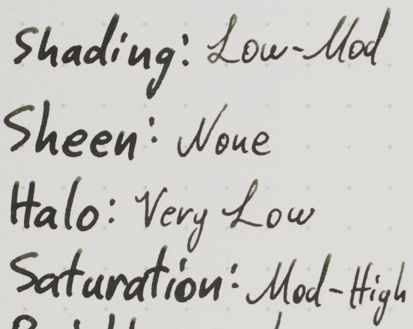

Strangely, shading for Montblanc British Racing Green is higher on Tomoe River (which, in my experience, flattens inks a little). The shading is quite nice but not strong. The dark can get pretty dark while lighter part of a stroke stays moderately dark.


There is sheen on Tomoe River but I consider it a technicality rather than a feature. You have to be looking for it to see it and when you do find it it’s a rather drab brown sheen.
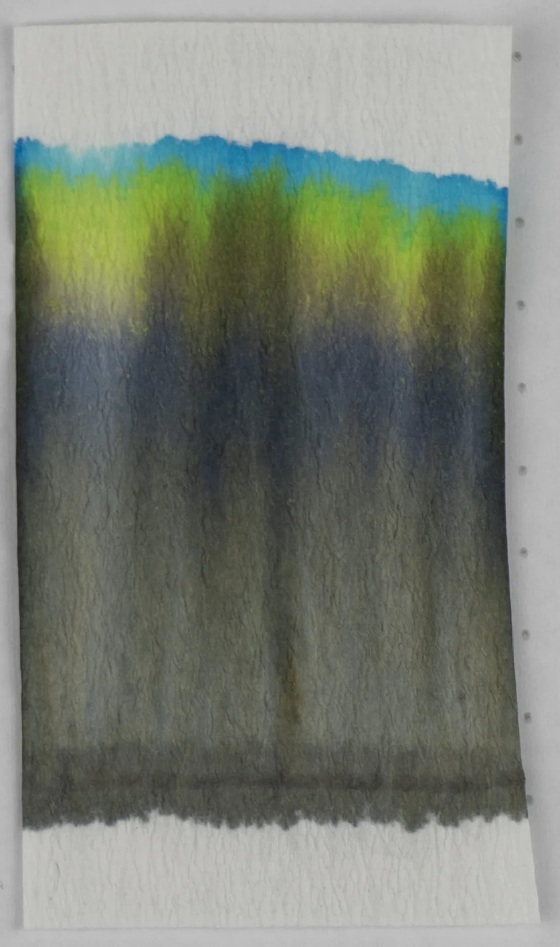


The chromatography is pretty interesting and you can possibly see why sometimes the ink seems blue leaning and sometimes yellow leaning. There is a bright line of turquoise followed but a yellow green, then yellow, brown, desaturated purple and then finally a dull green-grey. A lot to unpack here!
Dry time is a little slow on both Rhodia (80gsm) and Tomoe River (52gsm). Not extremely so but given that this ink feels decently wet it’s understandable.
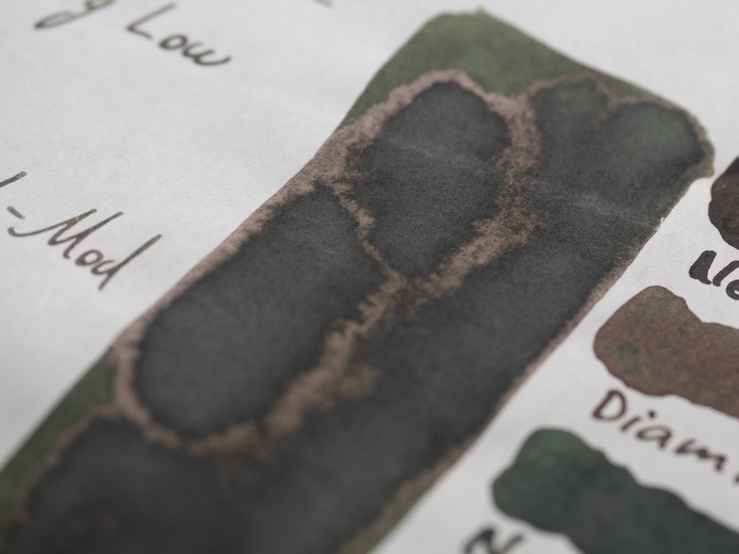
Water resistance is quite decent. There’s some wash of the colour over the page but the lines are very visible.
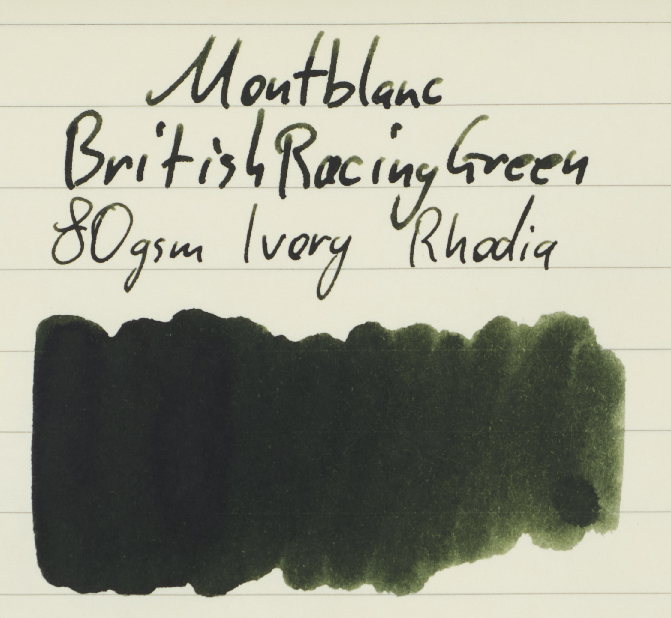
Review on 80gsm White Rhodia
On Rhodia, when compared to Tomoe River, the ink is a touch less yellow and a more saturated colour as well as darker. There is no smearing and the flow and lubrication feel only slightly less than on Tomoe River.
Noodler’s Luck of the Draw: is darker, flatter, slightly bluer, and less saturated;
Diamine Evergreen: is brighter, yellower, and more saturated;
Noodler’s Colorado Spruce: is darker, flatter, a bit bluer, and a similar saturation;
Diamine Classic Green: is brighter, yellower, and more saturated;
Diamine Epinard: is a similar brightness, but more saturated and a little yellower;
Diamine Salamander: is a similar brightness, comparable hue (though a touch bluer) but a bit flatter and less saturated;
J. Herbin Vert Empire: is very flat and less saturated, but a similar brightness and hue; and
Bungubox Dandyism: is flatter, much darker, and a bit bluer.
On Rhodia I’d pick Diamine Salamander as the closest even if it’s a little greyer.
Review 52gsm Ivory (white) Tomoe River
On Tomoe River, the ink is a little less saturated (especially where the ink pools), brighter and more yellow. There is no ink smearing and the ink is a delight to use on this paper.
Noodler’s Luck of the Draw: has lost quite a lot of saturation but is a similar brightness level now and hue;
Diamine Evergreen: is a lot closer on Tomoe River; only a little yellower, more highly saturated and brighter;
Noodler’s Colorado Spruce: is quite a bit bluer leaning now and is still too dark and also too saturated;
Diamine Classic Green: is closer again but little a bit brighter. It’s not too dissimilar with hue and saturation though (both a tad higher);
Diamine Epinard: is much darker and more saturated but a comparable hue;
Diamine Salamander: has lost a lot of saturation and brightness on Tomoe River and is now only similar in hue;
J. Herbin Vert Empire: has also lost a lot of brightness and saturation and is now also too blue (but the ink is less flat and more interesting!); and
Bungubox Dandyism: is still much too dark but is less blue.
On Tomoe River I’d choose Diamine Evergreen. It’s definitely a bit brighter and more saturated but it’s not a terrible alternative.
Three different Montblanc Bottles
I’m not sure which ink bottle is the newest out of the first to but I believe they are in chronological order. The first shoe bottle here is of Montblanc Emerald, then Montblanc British Racing Green, then Montblanc Irish Green. I do quite like the Emerald bottle!
British Racing Green Jaguar
For many many years I’ve had a little model car (Matchbox “Models of Yesteryear No. Y-1” Jaguar 1936 SS. 100). Came in perfectly suites to show of British Racing Green next to Montblanc British Racing Green!
Pelikan M120 Iconic Blue with steel medium & Pelikan M200 Café Crème with M400 gold medium
The Pelikan M120 Iconic Blue with steel medium writes closer to a western Fine nib and the Pelikan M200 Café Crème with M400 gold medium writes closer to a western broad (such is Pelikan; I’ve always had great nibs (one with a baby’s bottom - easily fixed) but their stated sizes rarely match reality!). The ink writes delightful out of both. They are decently wet pens but not gushers by any means. The M120 is a smooth finer nib and the M20/M400 has some very pleasant feedback.
Whenever I’ve seen this ink listed it’s often been for AU$200-$300 (US$138-207/€124-185). While I would find a way to save up and justify the costs I can’t honestly say that the value is there for that price (likewise with Lamy Dark Lilac being at a similar price now and that’s my top 5 ink!). This is a very tasteful ink which doesn’t step too far into a muddy colour. It’s professional enough and a classic. It’s well worth having but not at that price. AU$150 is a much more reasonable upper price. But of course I’m completely ignoring scarcity. This ink is very difficult to get so naturally the price is high. It is a lovely colour and I think it has better performance than many modern Montblanc inks so if you find a bottle at a reasonable price, jump on it!
Again, many many thanks to Nicholas for making this review happen!
✒︎ ✑ ✒︎ ✑
I've listed all my inks and all my pens in their respective pages. Please let me know which inks you'd like to review next via the comments, Twitter, Instagram, or contact me directly.
For blog updated you can follow @macchiato_man on Twitter, subscribe via email, or like my Facebook page.
I was not compensated for this review and everything here is my own honest opinion. There are no affiliate links in this review.